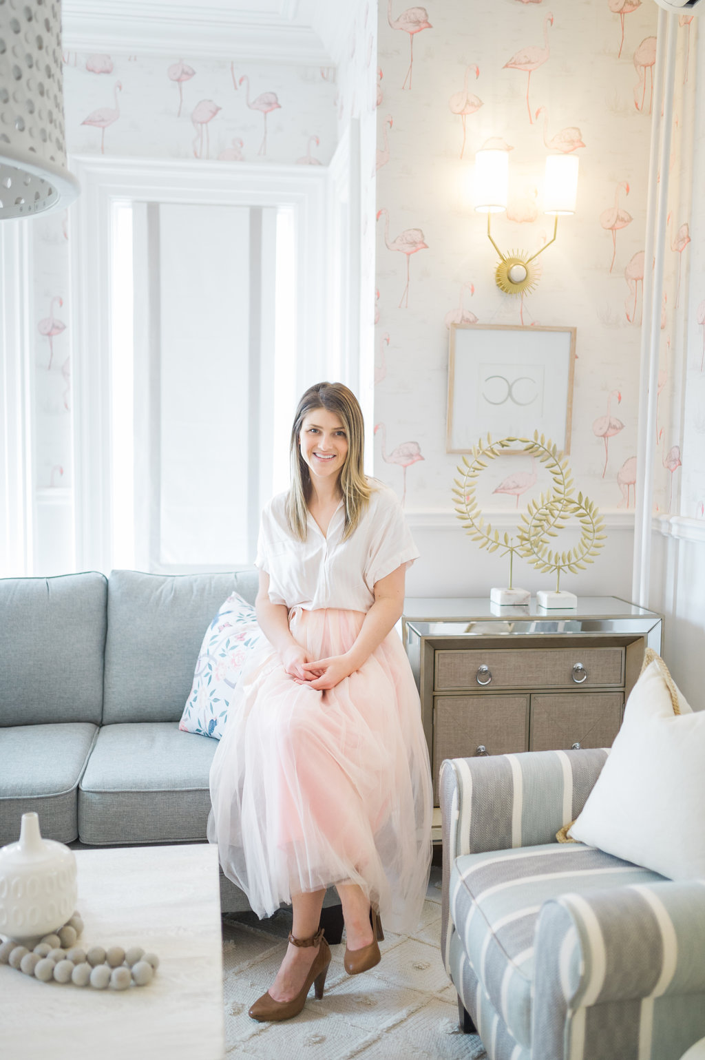
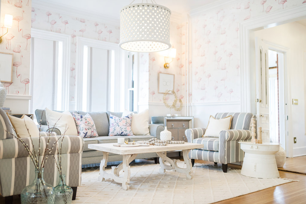
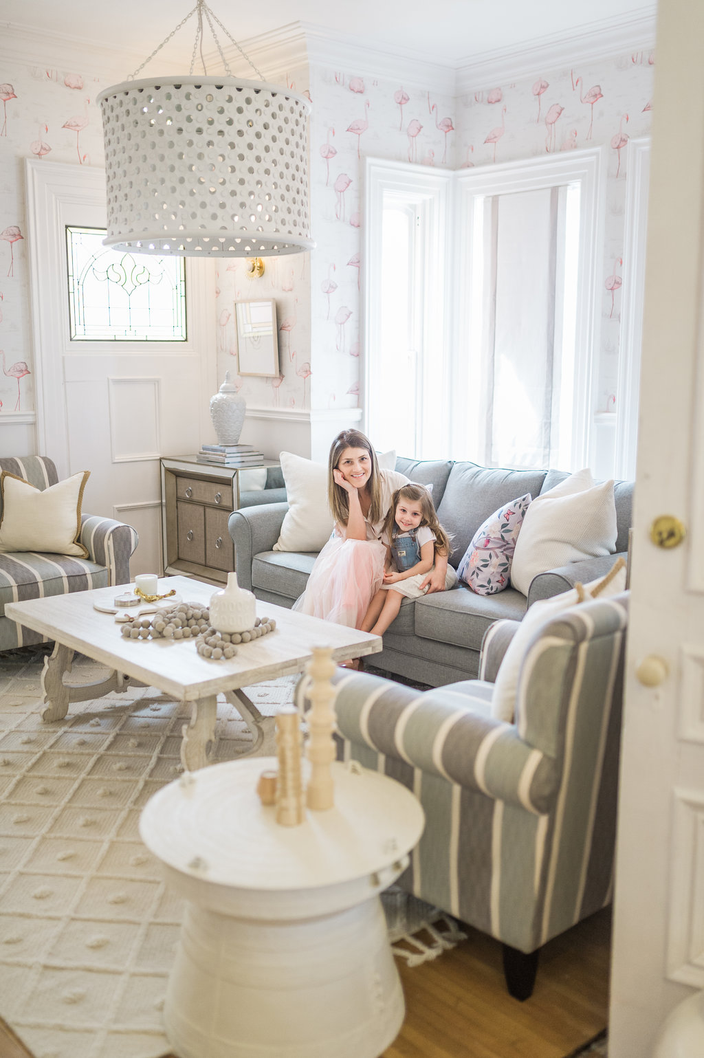
 You guys I am so happy with how our transitional glam family room furniture makeover turned out! I can’t even tell you! The best way to describe this transformation is that it feels like a breath of fresh air! In case you’re new to the project, I partnered with The Brick to completely transform our family room. Before getting our new furniture, the space felt like an afterthought, not the room that I had dreamed of for our family to spend so much of our time in. I wanted a room that felt really inspiring, comfortable, functional, but that still had a transitional glam designer look. Thank you so much to The Brick for checking every one of those boxes and then some!!
Disclosure: This post is sponsored by The Brick. As always, all of the opinions here are my own.
All Cleaned Out and Ready for a Makeover! 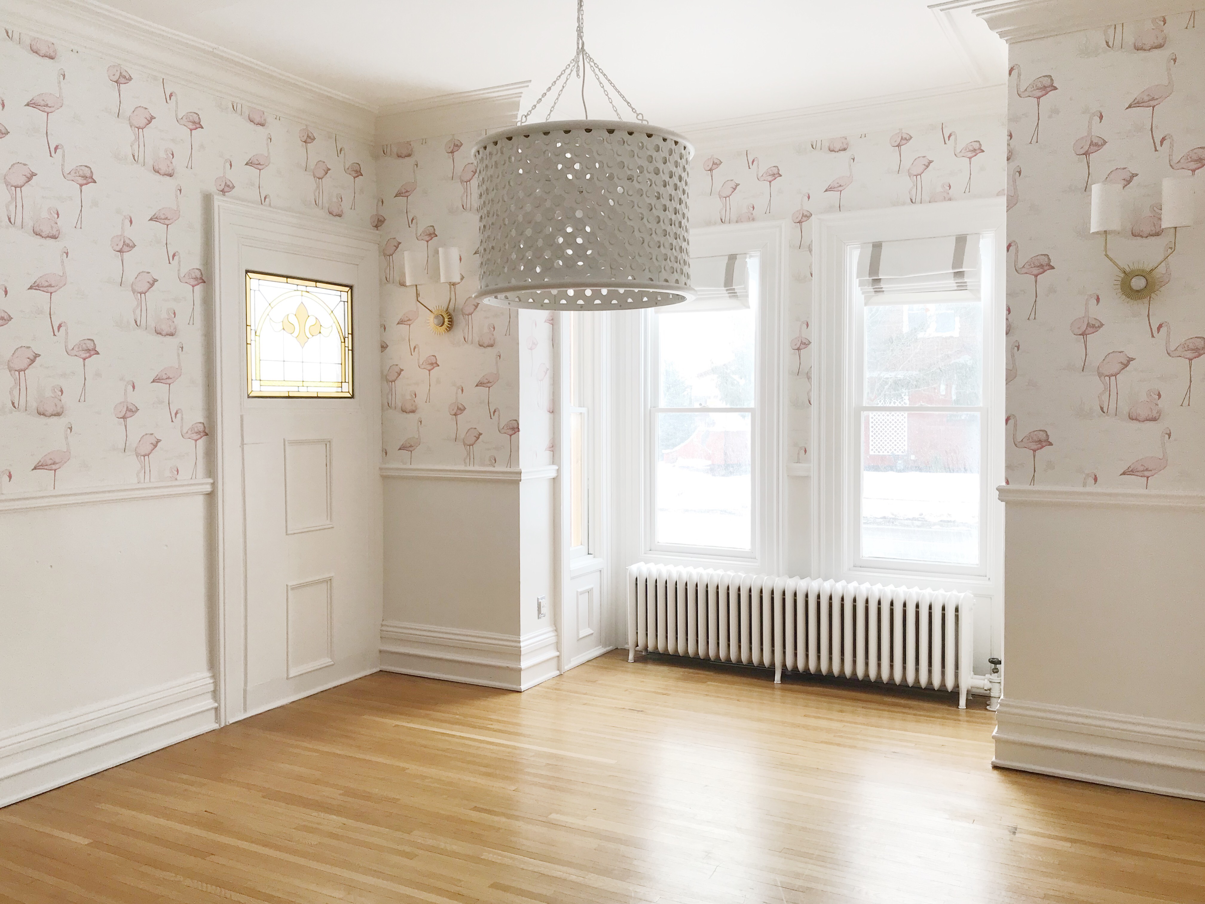
Mirrored Cabinets
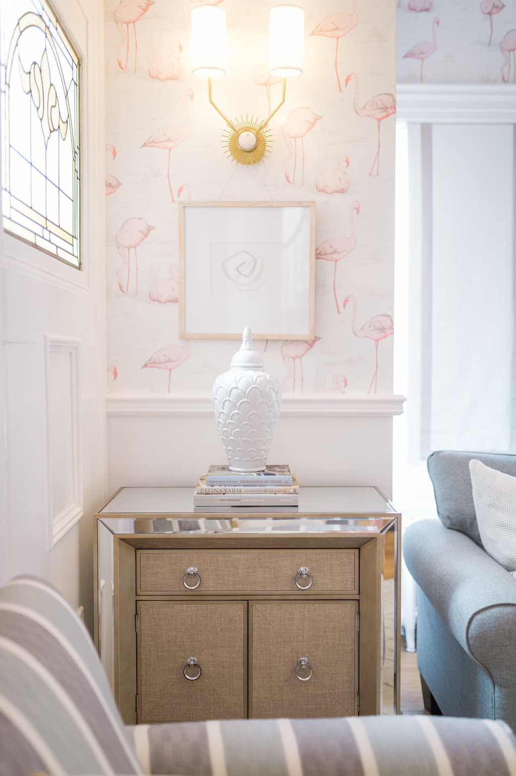 I fell in love with The Brick’s mirrored 32″ Enna Accent Cabinet! The cabinet is so substantial. The piece feels like a credenza. The cabinet has a ton of storage. We use our Enna cabinets to hold our laptops, tablets, current books, remotes etc. All of the clutter we have out laying on the floor and coffee table normally fits neatly tucked away…I’m so happy about the new storage. It’s amazing to be able to clean off the tabletops completely but then also have a place to style on the cabinet top.
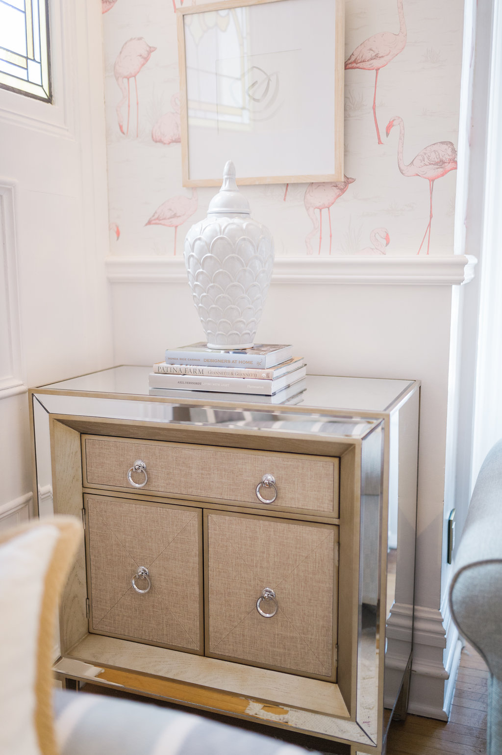
In addition to storage, I chose these cabinets because of their details! The mirrors give the family room an elevated transitional glam feel and sparkle. The fabric on the front doors is such a high end detail; it’s a cross between a linen fabric and a grasscloth wallpaper with a ton of texture and is perfect in every way.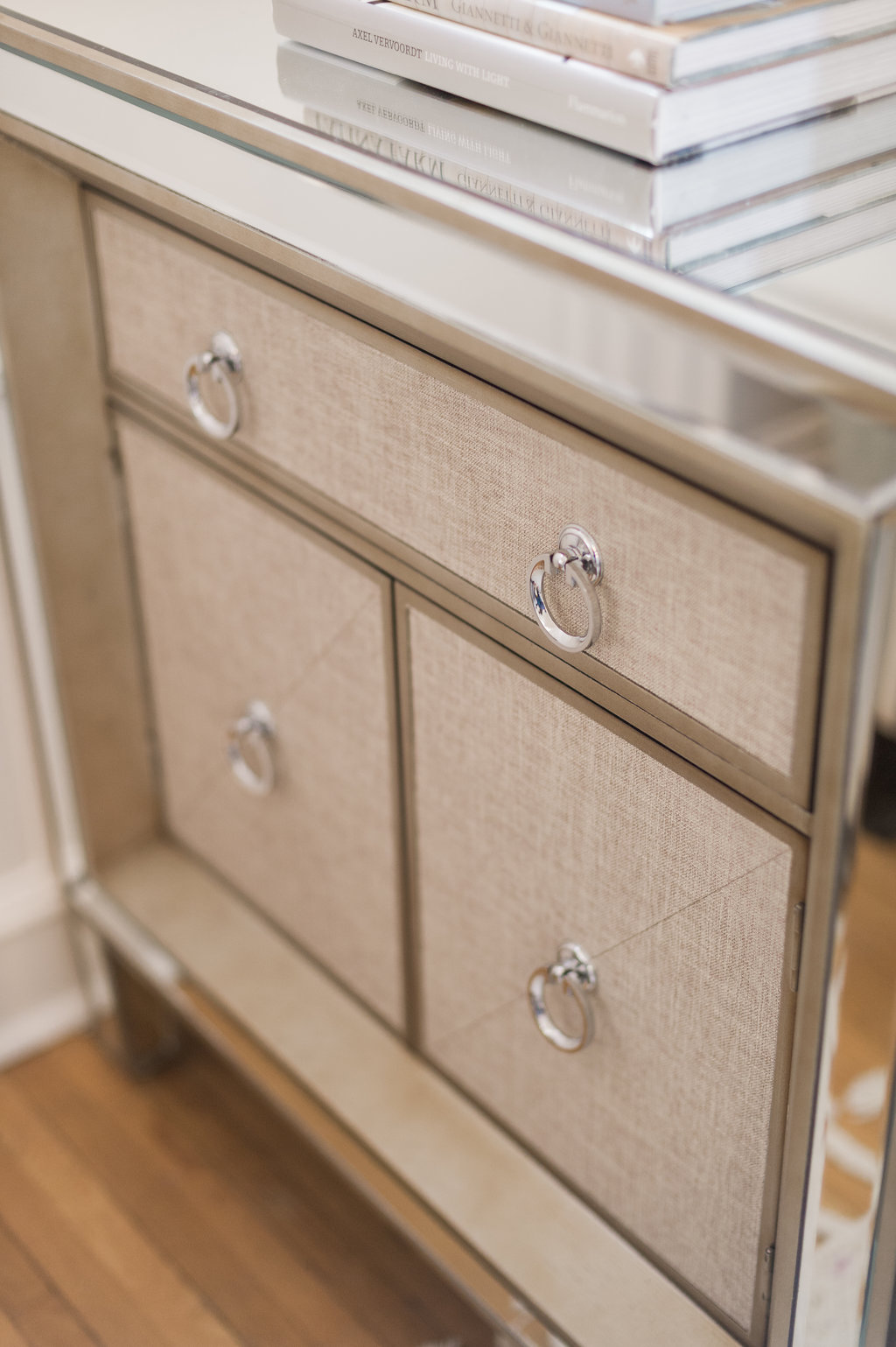
Testimonial
Matt normally says nothing about my design decisions and this time he said, these are really nice eh?! Which for him is the equivalent of professing his love for the cabinets by shouting from the rooftop. Enna Cabinets = Family Approved! lol!
Sofa: Blue is the New Grey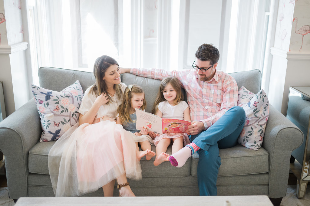
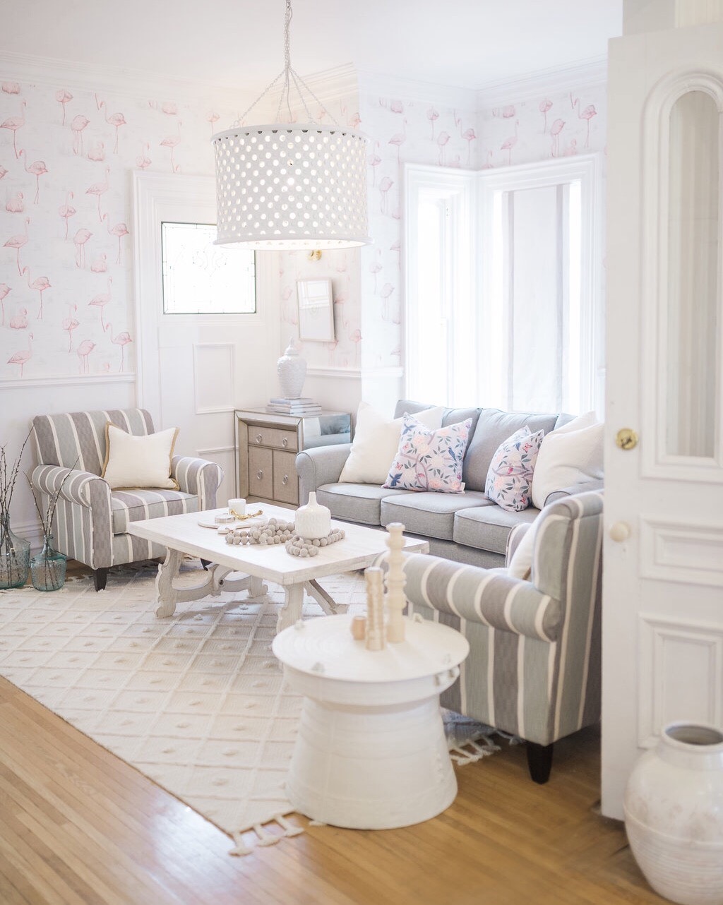
I totally feel like the light blue colour of this Tula Sofa in mist from The Brick is the new alternative to grey. It’s so versatile like grey, but it feels fresh and current. The shape of the sofa is nicely tailored for a transitional style. The fabric is also awesome to keep clean…which is beyond important right?!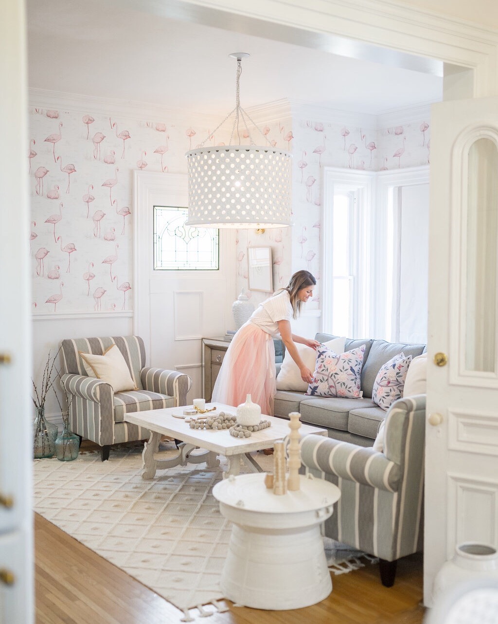
Striped Armchairs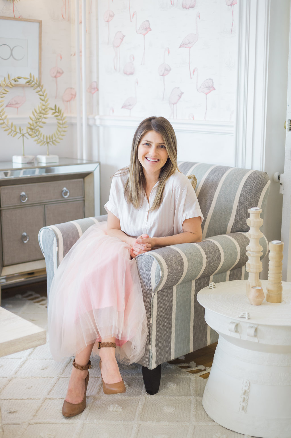
I paired the sofa with the matching striped Tula Armchairs from The Brick. The chairs are so new that they aren’t online yet, so I can’t link them, but they are available to see and order in store. I have always been obsessed with striped chairs because they are bold, but so classic.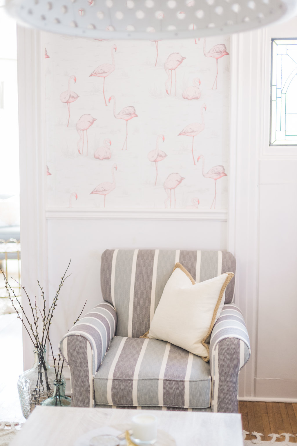
Fabric
The colour combination of light blue and grey fabric on the armchairs is really gorgeous together! The fabric has a tight knit chevron pattern and is stunning in person and really soft. You can choose to get your sofa and loveseat in the blue or grey that matches these chairs exactly. We chose the blue.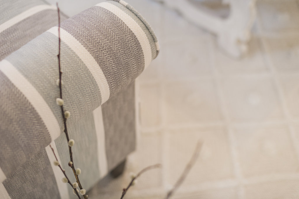
The chairs are really big and comfy, so I can sit with my laptop on the arm and blog, which is something I love to do! 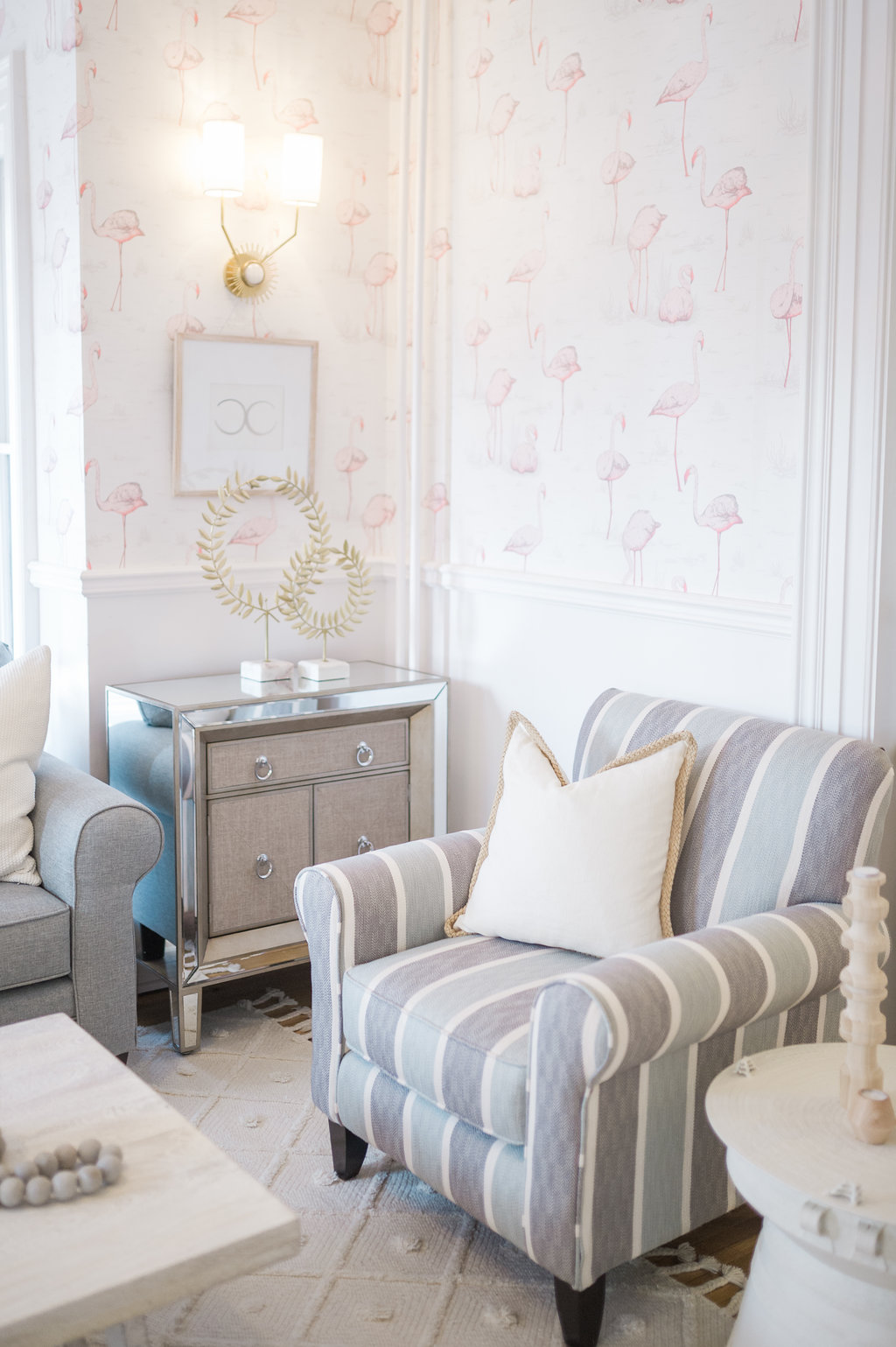
Accessories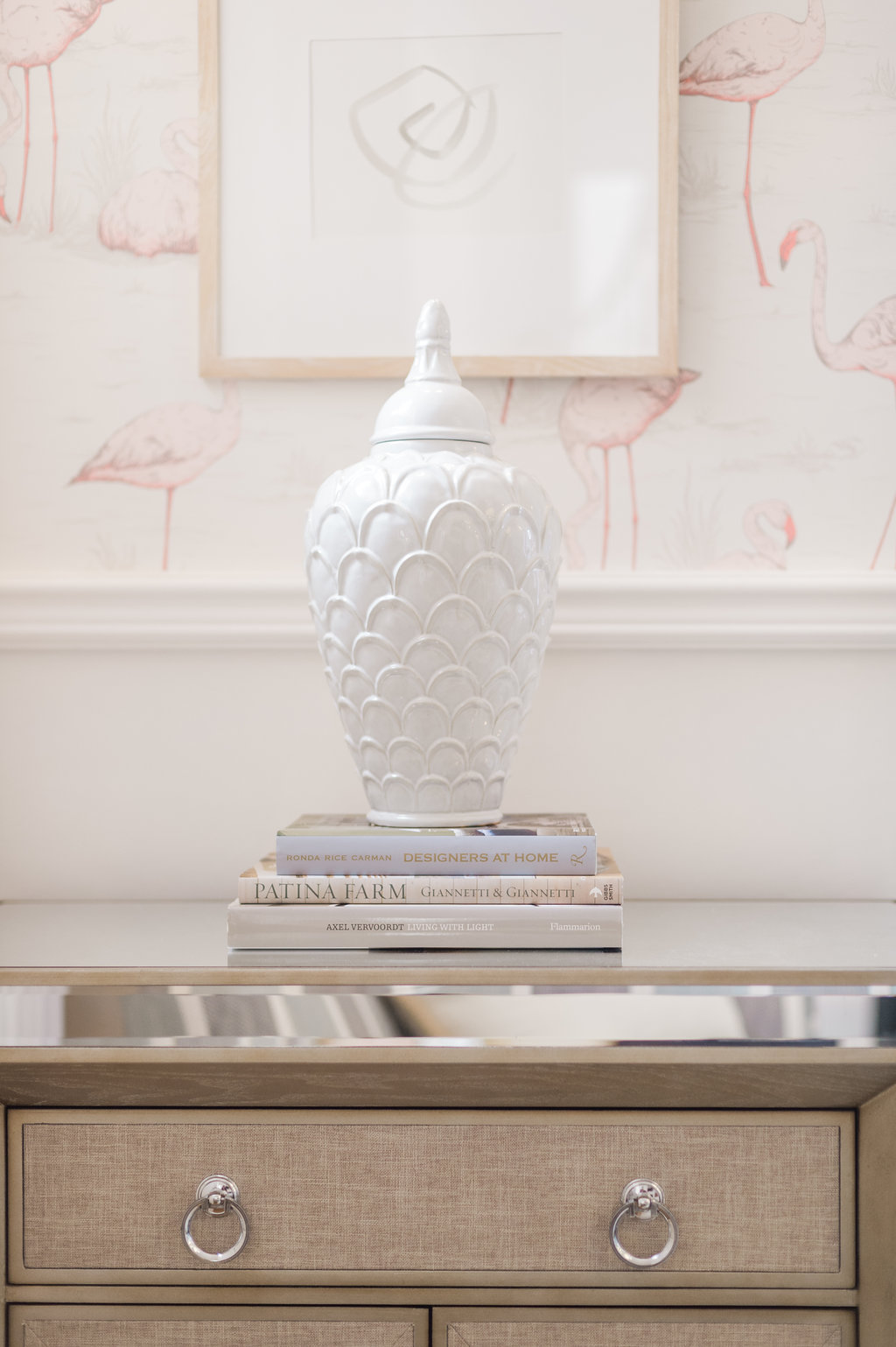
Lastly, The Brick helped me polish off my space with their accessories! My favourite piece that I found is the white scalloped ginger jar. White ginger jars are a staple in the quintessential transitional glam space. I loved this jar so much that I got two and I’m not sorry about it at all!
I also found this amazing statement marble and wood charcuterie board that I’m using as a tray for the coffee table. The cutting board is the perfect place for a candle and coasters.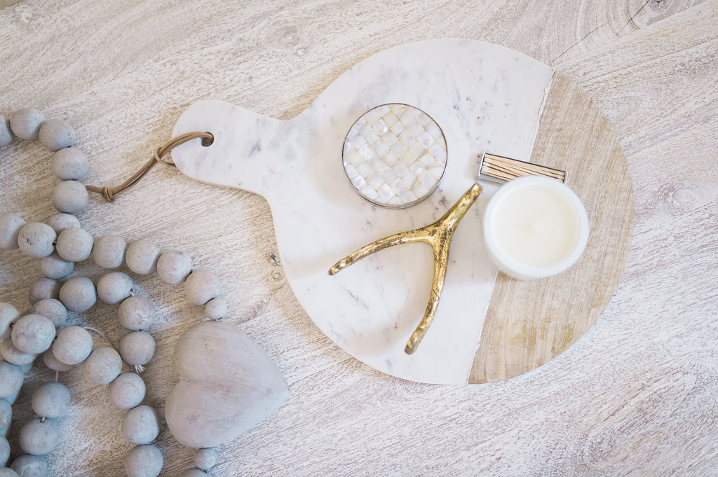
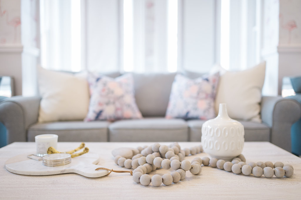
I also found this super cute modern white vase at The Brick. It’s the perfect vibe for the space. You can’t find the accessories online but they have tons and tons on display in the store that you can take with you. I’ve become a little obsessed and want to go back, already. New pieces are added weekly!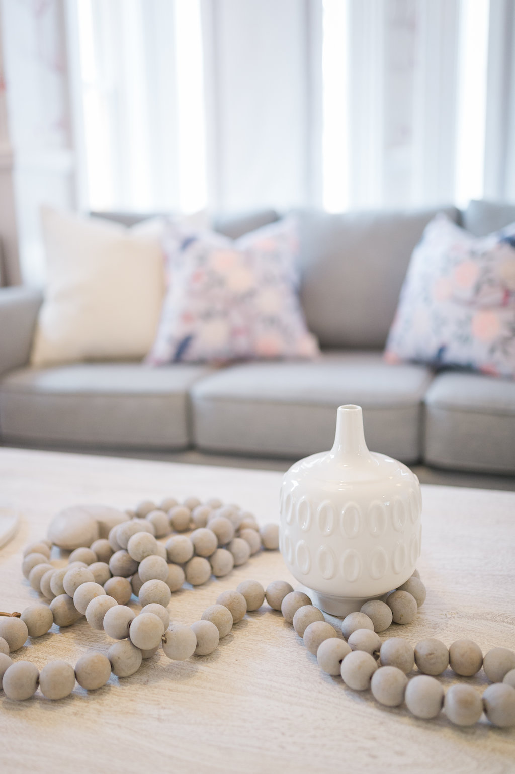
Another awesome set of accessories from The Brick in the family room are the demijohn vases. I’ve styled them with pussy willows, which feel so fresh for Spring! 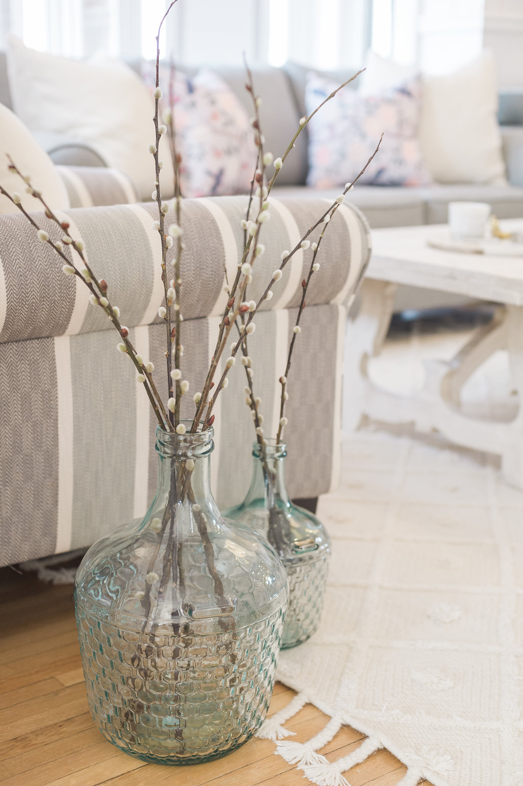
Accessories Restyled
You can see all of these accessories styled in a completely different way in my Spring Kitchen Tour! The white ginger jars kill it beside my sink 😉 I have a feeling that they will all be making an appearance in every room in our house!
A Look Back at the Space Before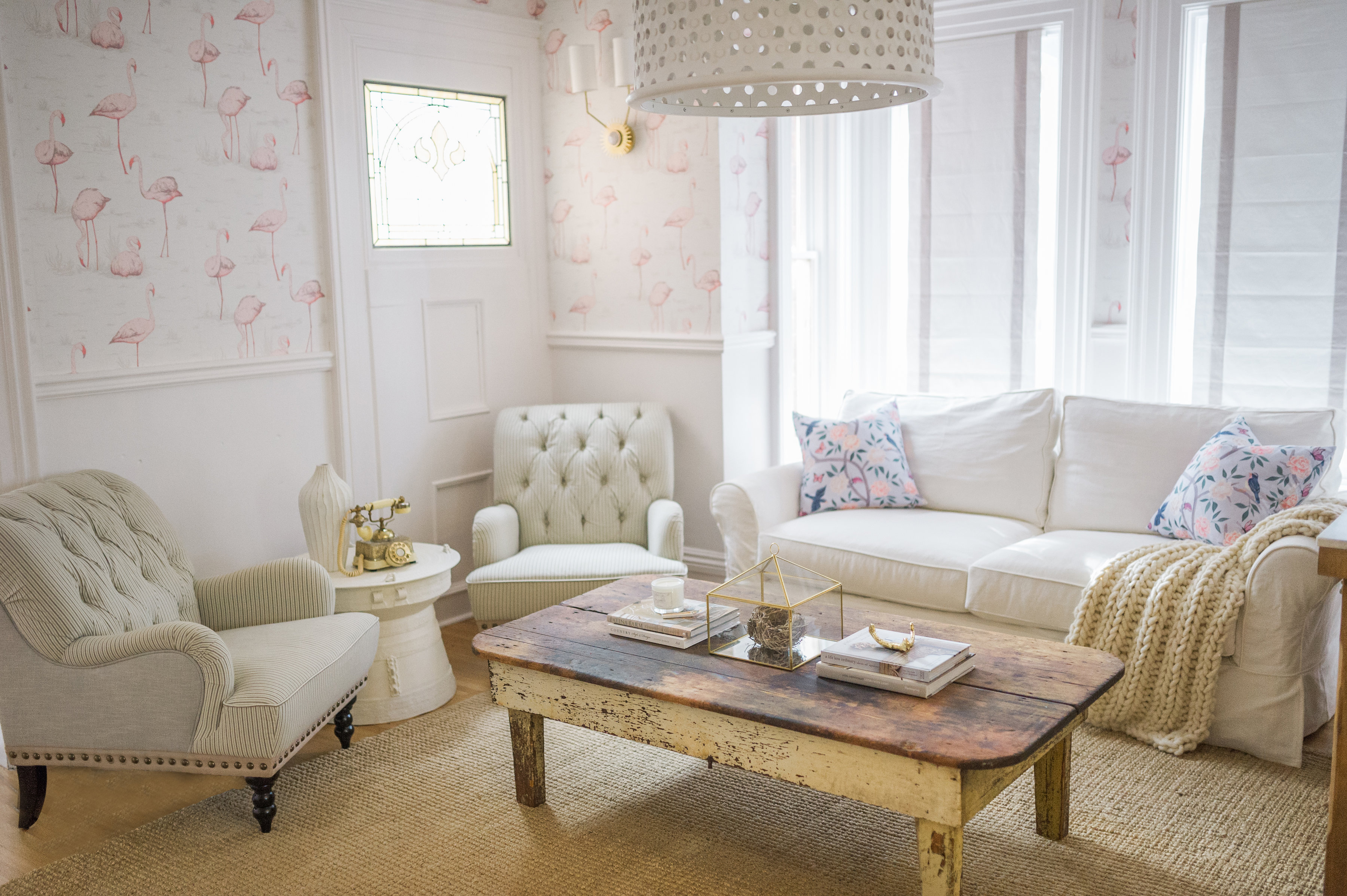
Change in Layout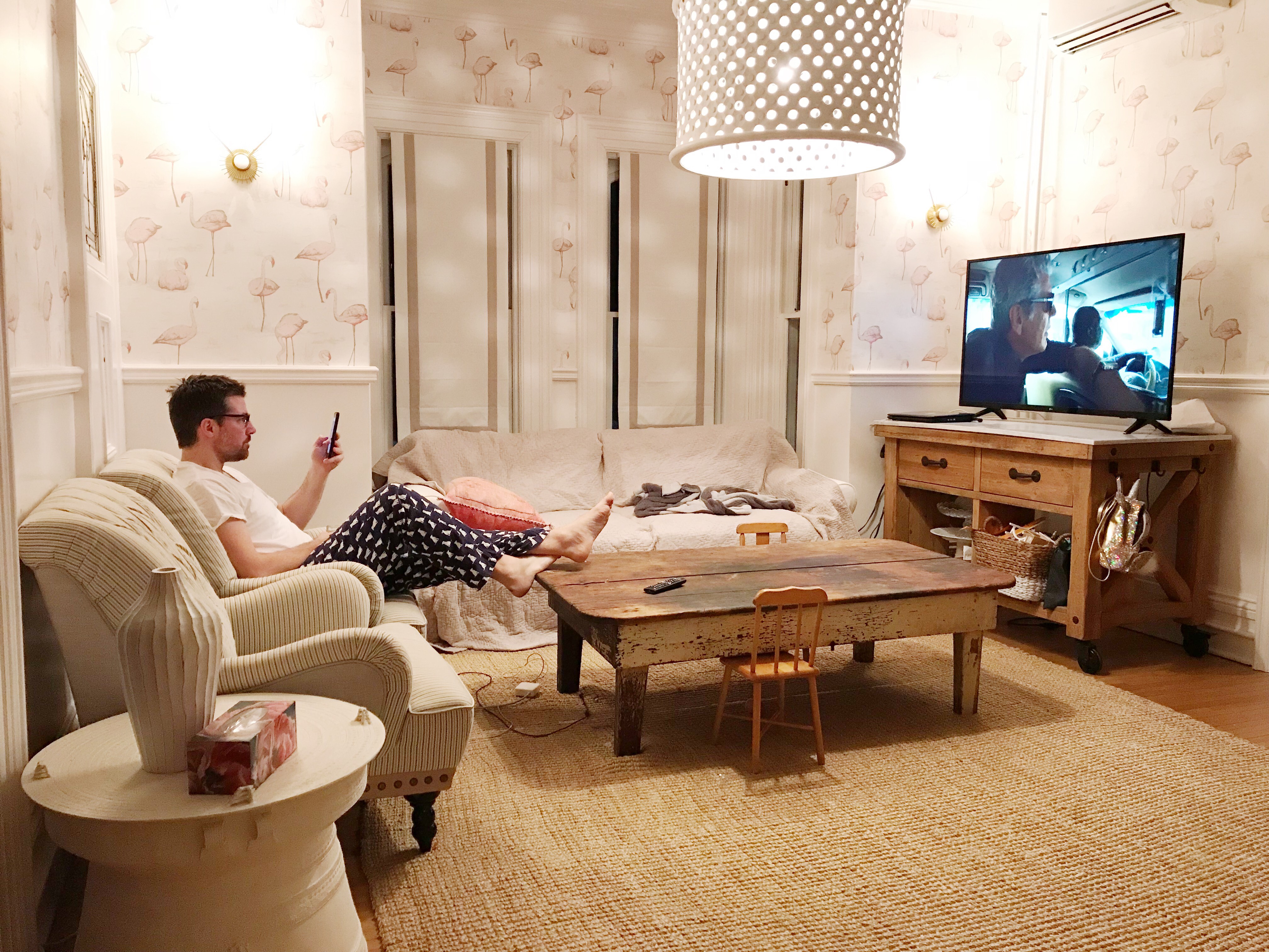
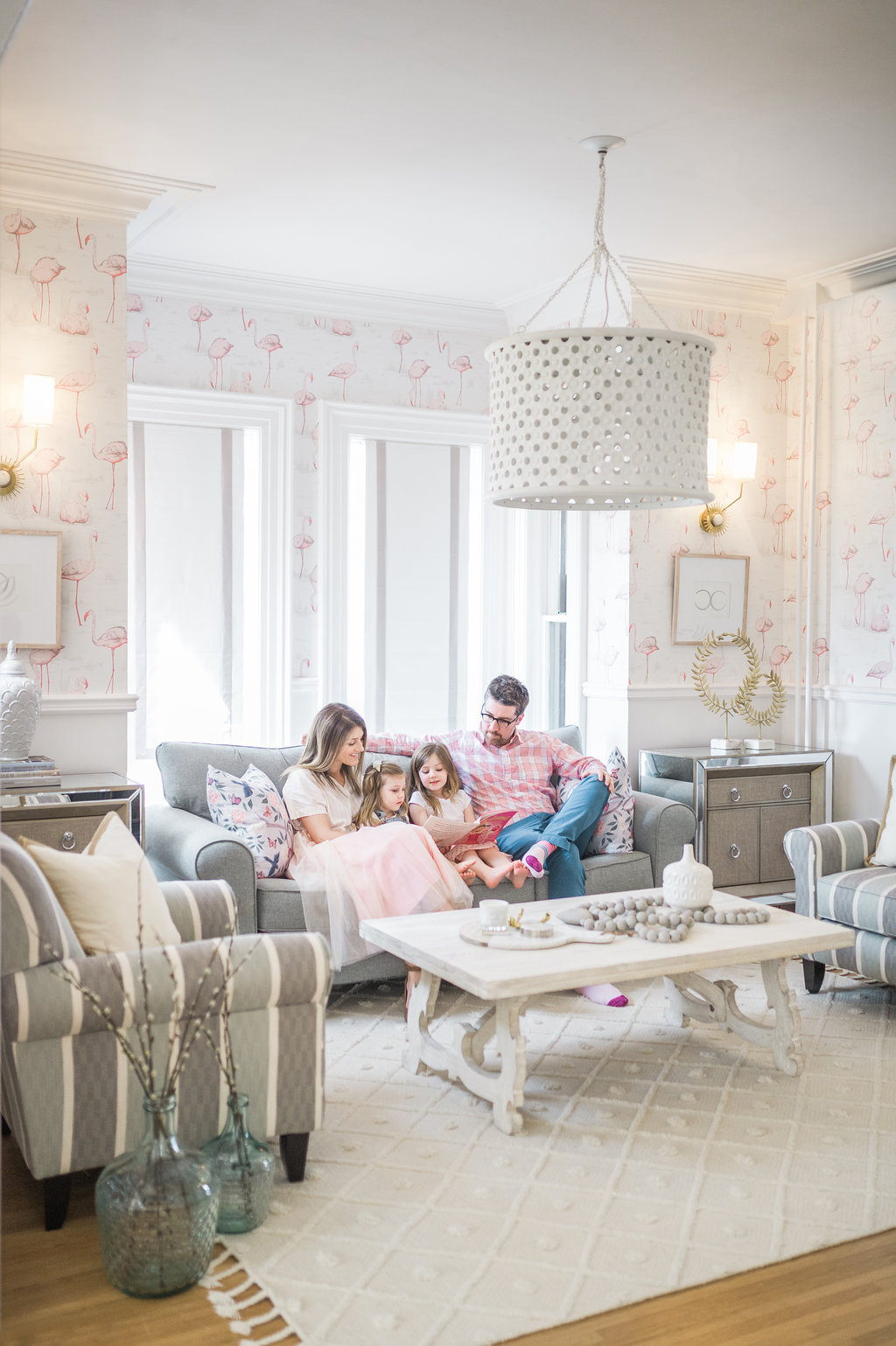
The first thing we changed about the original layout was to put the T.V. over the fireplace, so we could have seating on all sides of the room. This made such a fantastic difference! The flow of the space works so well now for conversation and relaxing with a movie (or the Real Housewives…let’s be real!! lol!)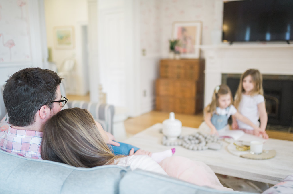
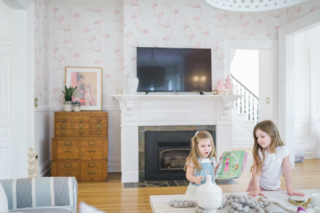
Traditional Glam Finished Space!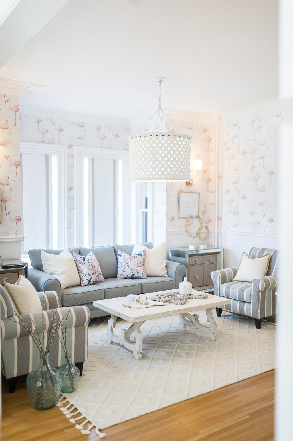

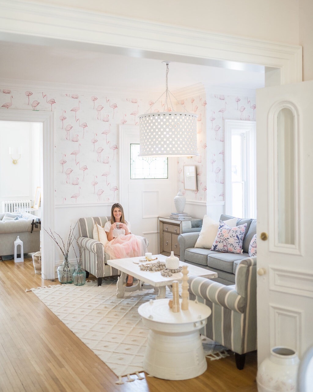
 Pre-Renovation
In case you want to see where we started back in July check out the renovation reveal of our family room! We’ve come so far!!! Like it had red walls – far!
Thank you so much again to The Brick for the family room of our dreams!
Ok I’m actually dying to find out what you guys think of the space?!?!

Beautiful! Great job as always!
Thanks so much Vanessa! So glad you like it! xo
Leslie this is so fresh and beautiful! This reveal has exceeded my high expectations. I have to be honest and say that I haven’t looked at furniture at the Brick in years. I’ve bought appliances but never any furniture. I’ll have to go check it out! Even those accessories are perfect! Also love the coffee table!
Hi Agata, I’m SO glad that you like it!!! You know what that’s amazing because this partnership gave me a chance to see them with fresh eyes too, and I found so many things that I love! There is actually so many more awesome pieces from The Brick still to come in upcoming reveals in my home!
It’s soooo good! You nailed it. Love the layout and those striped chairs!! Xoxo
Hey Girl! Thank you so much for stopping by! I’m so glad you like the chairs…they are one of those…are these going to work bold patterns and you just grit your teeth and go for it! So I’m so happy to hear you say that!
Leslie!! You did such an amazing job with this room! Every detail is stunning!
Your style is so inspirational!
XO
Lacey
serioulsy?! Thank you for writing such an encouraging comment!! I’m so pumped that you like it!! thanks again! xo
Such an interesting and relaxing space! I love your choices of colors, so different from what I have seen before. You are in inspiration, we just bought a house and I am planning to use the flamingo wallpaper.
PS: Side note/question, is this wallpaper bright in color overall or is it more towards grayish? In some pictures the flamingos seem bright pink and in others the colors are more muted.
Thank you in advance!
Thank you so much! You will love it! Hmmm it has a few pink shades in it. You can order samples from Cole & Son and they are only a couple bucks if you go on their website. They are a ton of colourways for the flamingos too. It’s not super bright. Check their website and even the photos are very accurate. But the samples come quick! It’s really awesome in person…has a few nice greige colours in it as well in addition to the pink! good luck!
Thank you!
Oh my gosh it looks amazing!! And that mirrored cabinet is the bomb! Had no idea the Brick had anything like that. Beautifully done!
Thank you! Oh my gosh the mirrored cabinet is the BOMB! lol!! that’s like the only way to describe it…so freaking high end glam feeling…like just EVERYTHING! I know right…it’s so cool that you can shop local for special pieces and the price is awesome too! Thanks for the comment!
Literally love everything about this room and your impeccable style!
Moving to Southern Ontario in July from the UK and so excited that I can get some of the pieces you’ve used in your renovation!
Hi! Oh my gosh that’s so exciting!! You’re going to love it here!! Thank you so much for the comment!! Good luck with your move!! xoxxo
Leslie,I can’t believe the transformation of this room. The furniture is beyond gorgeous, and the scale is perfect. The thing that I love the most however is that coffee table. I can’t believe you can get that at the brick. It’s charming and cottagey yet sophisticated and up to date as well. Enjoy your new room, you did a fantastic job pulling it all together.
Hi Mary! Thank you! The coffee table is my own actually, but everything else is The Brick! I’m so glad you like it! Thank you for taking the time to write such a sweet comment! Day = Made!
I love this space Leslie! So bright but with gorgeous pops of beautiful muted tones. So fun and so comfy looking! Great job!
Oh thank you so much! The colour was so important to the plan so I’m so glad you like it! I think the choices in colour for furniture really helps to add a “designer” feeling! Thank you so much for taking the time to write a sweet comment! I really appreciate the support!
Beautiful Leslie as usual!!! I’m in need of new furniture, just love those chairs!
Thanks so much Kim! They are super comfortable…come over and try them! xoxo
So gorgeous Leslie!
Thank you so much, I’m so pumped that you like it!!
Wow such a difference! I also loved how you incorporated the TV – always nice to see a beautiful AND practical design! I think my favourite piece is the coffee table. Stunning!
Thank you so much! Yes definitely need a t.v….netflix is key!! hahah!