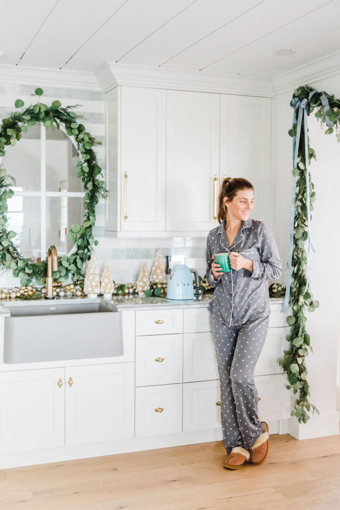
Hey Guys! I’m popping back in this week to keep sharing our new Lake House reno with you, this time I’m sharing the Lake House Coffee and Wine Bar Reveal! This is a little space that packs a big style punch with lots of details, so it’s getting its own blog post…plus it’s all dolled up for the Holidays! It’s also the place we make coffee, so how much important can you get than that?! lol! K whatever you do, read till the end because you have to see the before and after of this renovated space!
In case you missed it, last week I shared the first reveal at our new home the “Lake House Dining Room Reveal: Modern Feminine Coastal” I would love it if you checked it out!
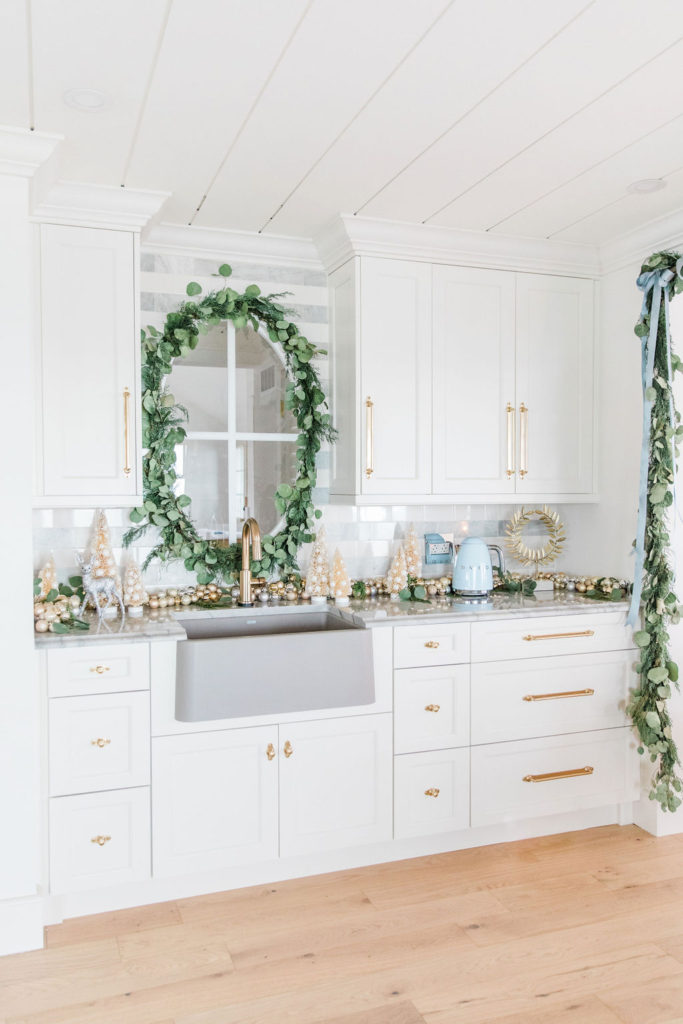
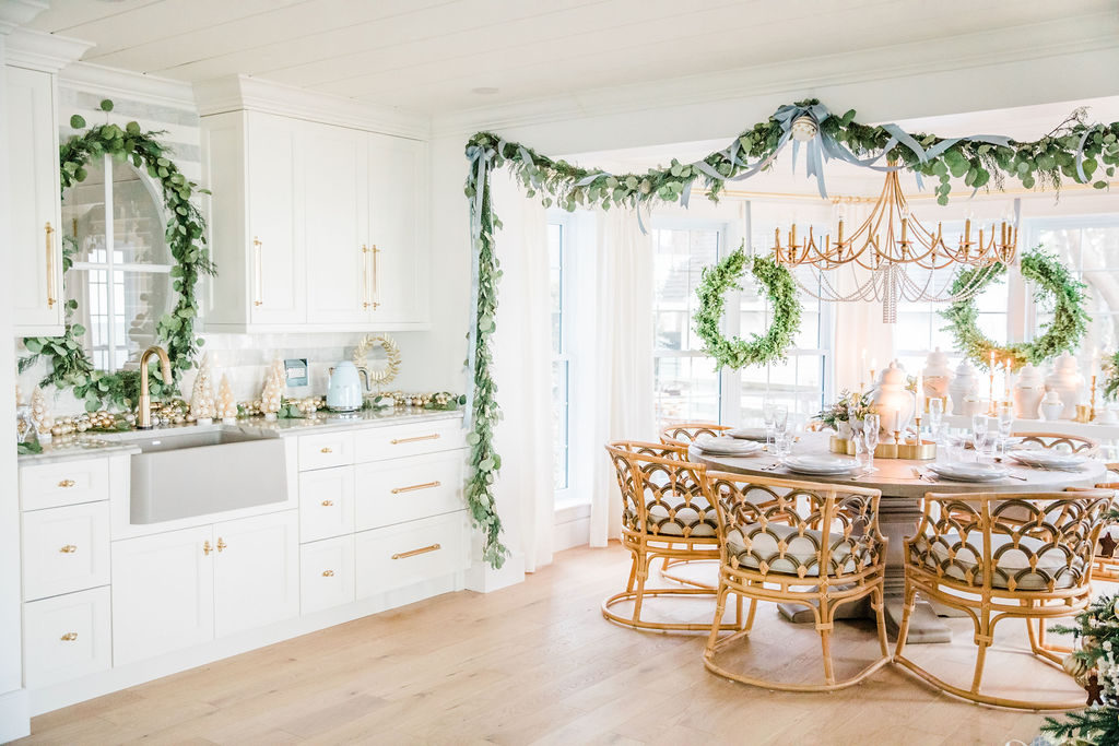
Ok, back to the coffee and wine bar! Once I share the kitchen with you, you’ll see that there wasn’t another place to keep the coffee maker, toaster, and kettle than over here! I designed the other spaces to be very open with solid windows and very little wall space, so this little spot has to work functionality overtime! This cabinet run is right off the dining room, so it’s perfect for: plates; all of our glassware; mugs; placemats; napkin rings; dish towels, and bar pieces like corkscrews and specialty glasses, etc. Many of the drawers aren’t filled yet, but that won’t last long! lol!
I took these photos a day after we moved in (literally the place went from zero-Christmas in one day! lol! Thank you to Cori from CJH Florals for that!! How cute is this Eucalyptus wreath around our oval window?!), so we didn’t even have our coffee maker set up yet. I’m actually searching for just the right one that will fit under the cabinets…until then ours sits against the wall on the left. The toaster will sit on the right, once we have one. We left ours in our last home because we turned it into a vacation rental. I might be broiling our toast in the oven at the moment lol-true story! My husband surprised me with this kettle after we moved in! I love it because my accent colour at this house is a soft hydrangea blue!
Interior Oval Window
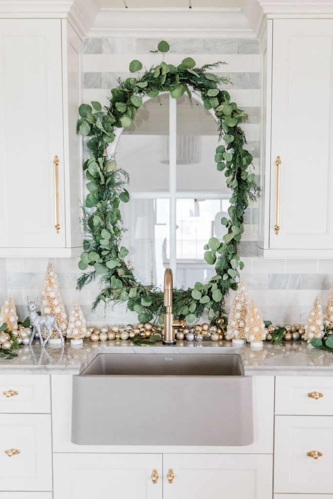
Oh my gosh I love this window! I have always wanted an oval window- they feel so coastal and classic, and I’m so happy that I found a spot for one in our reno! We did not have the perfect exterior wall for it, so I put it on an interior wall! The view through the window is to our main side entrance and it’s looking at our mudroom. But don’t worry, it’s not a typical mudroom-I’m nicknaming it the mud-ballroom because I’ve put so many special details in it! I can’t wait to show you! I also love this window because coming from the other way, as soon as you come in the house the oval window gives you a view of the lake through the patio doors opposite which was a super important detail I wanted to have!
Grey Farmhouse Sink
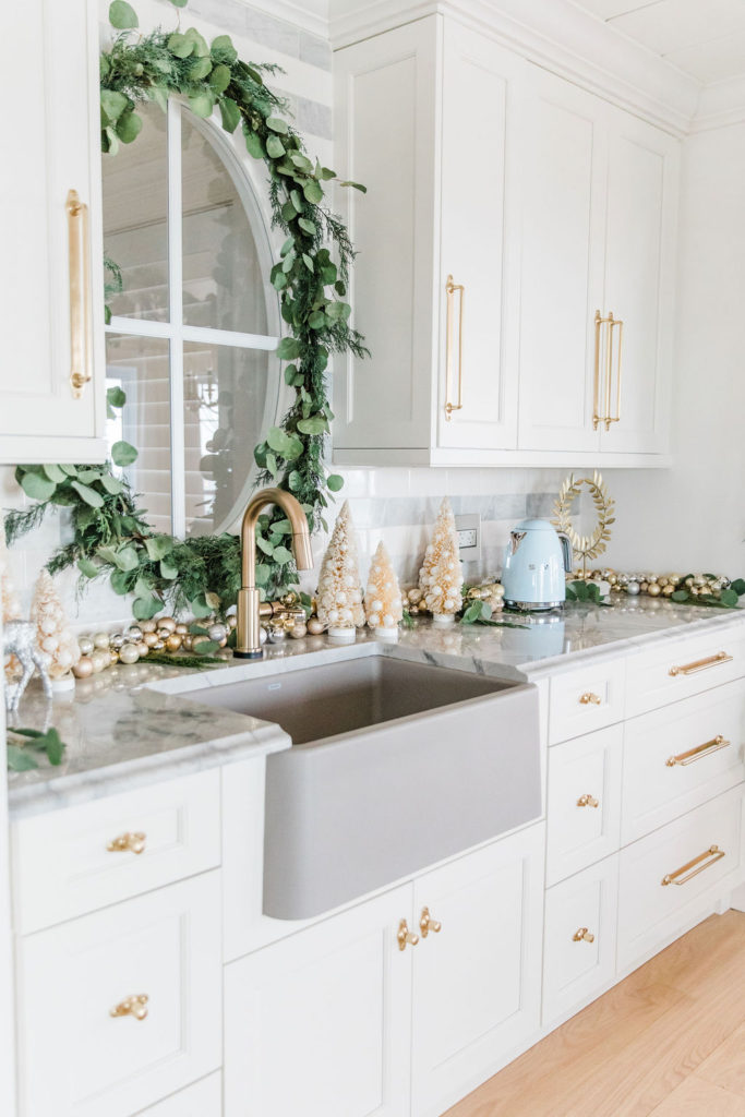
This is sink is just so chunky and cool! I love coloured sinks- our last sink was pink! However, after 3 kitchen renos before this one, I have learned that sinks need to be indestructable…so they don’t crack and/or stain! Farmhouse sinks are famous for getting little hairline cracks everywhere and staining like crazy! Um no chance in the world of that happening with this Blanco IKON 27 Granite composite sink in SILGRANIT in the colour concrete gray. I really loved Blanco’s new concrete gray colour and chose it for the lake house sink because it ties in so well with our counters and offers a pop of colour against our all white cabinets, and I also love the look of the brass faucet and hardware against the grey. You have to feel the material of the sink it’s really nice!
This sink is 27″ wide which is so unique because sinks don’t usually come that small in apron/farmouse style. This smaller size meant that I could use it in our coffee and wine bar and then use the large IKON 33 sink in our island and they look so good together! I can’t wait to show you how the full space functions as a whole! Wouldn’t this sink also be perfect in a laundry room?!
Prep Faucet
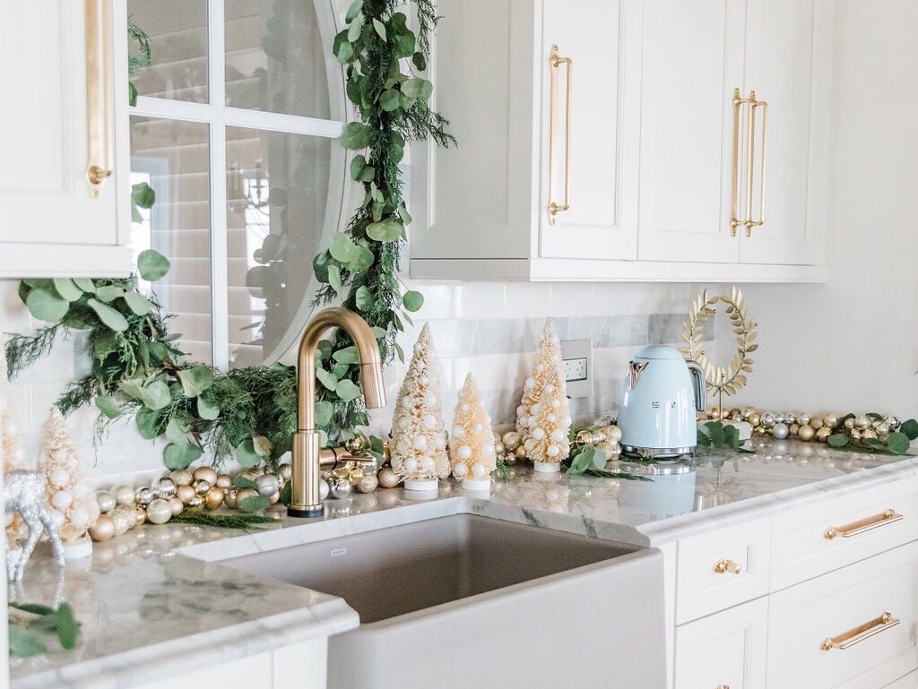
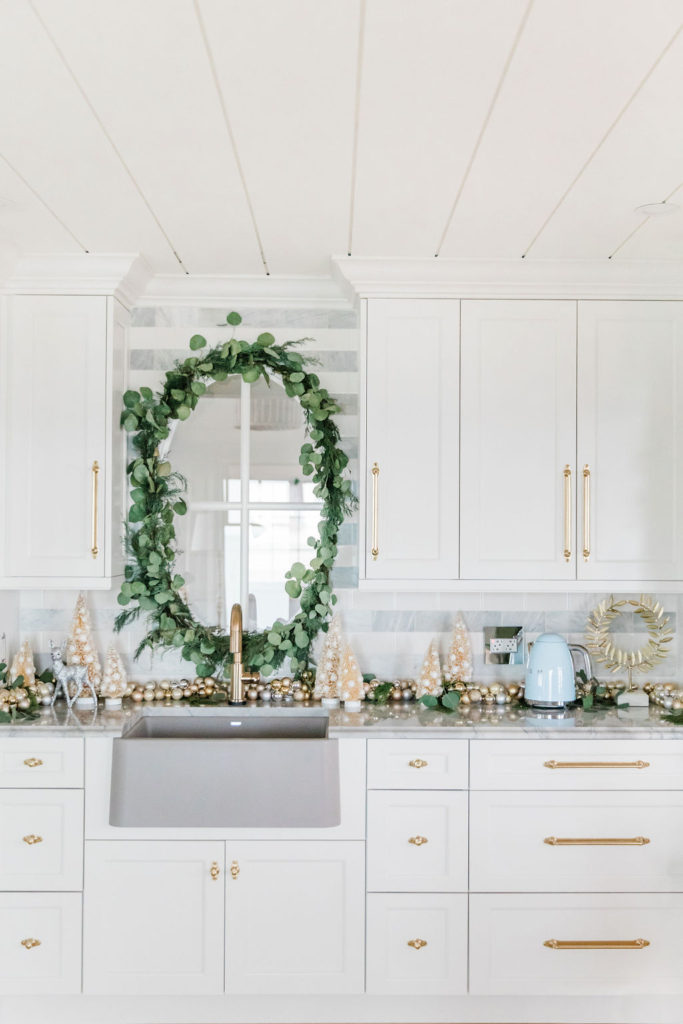
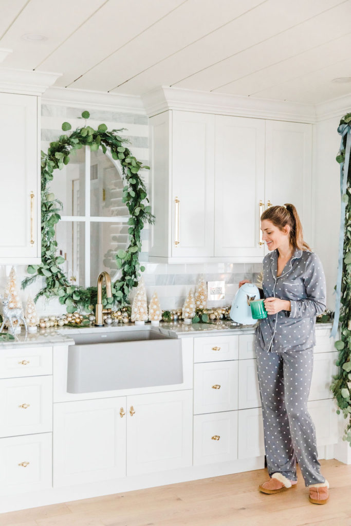
Our faucet is from Delta. It’s the TRINSIC Single Handle Pull-Down Bar / Prep Faucet with Touch2O Technology. I had this exact faucet two houses ago and I never got over it! You can see it in our kitchen all decorated for the holidays at our last home. I went for a faucet where you mix hot and cold and while it looked really gorgeous, it was a major pain after having something so stunningly practical, so I went back to the tried and true faucets we had before. They rock- you just can’t go wrong. I really like the touch function- it takes a second to get used to, but once you’re used to it, you can’t live without it! ***Also grab the drain to match…it looks so good with our grey sink which I will show you in our big kitchen reveal post coming soon!
Plugs and Plate Covers
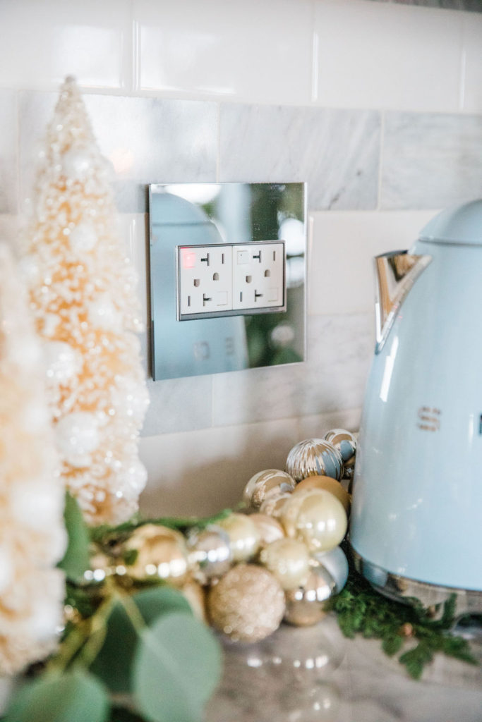
In our last home, we discovered the Legrand Adorne collection for our outlets and switches. We got non-stop compliments on them, so I knew I had to have them again at our new home! Our last home featured the brushed brass wall plates, and you can see that here. In this home we are trying out a couple of new styles. The style in our coffee and wine bar is the MIRROR 2-Gang Wall Plate. It’s really beautiful. The plate is a real mirror with beautifully finished edges, which is gorgeous with all the metallics reflected in this decor. If you love mirrors and mirrored furniture pieces have a look at these wall plates! The light switches are my favourite and you’ll see them when we further reveal our home. This is the outlet in the photo.
Before and After!!!!
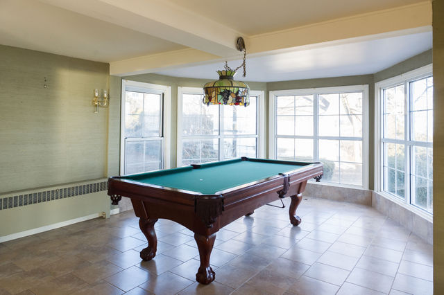
Holy Crap guys, this one is pretty wild! Isn’t this crazy?! It’s hard to put into words how cold and yucky this house was…but it’s not cold and yucky anymore, in fact, it’s literally the only place I want to be ever!!
Shiplap Ceiling
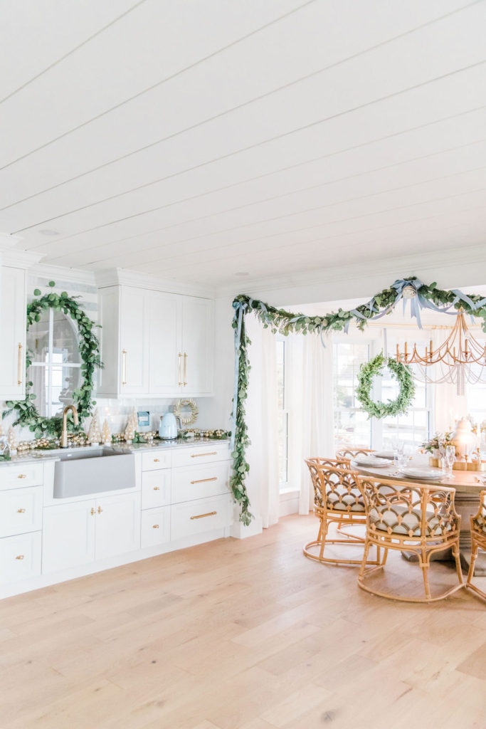
You can really see our Metrie Shiplap ceiling in this image, so I’m re-including the info from my last post below for you in case you want to achieve the look!!
We achieved the look of our ceiling with Metrie Option M Shiplap linked here. We used 16′ legnths, so we have no seams! The ceiling looks amazing and feels so coastal. With 8′ ceilings the shiplap really adds much needed sophistication and they are just stunning in person. The crown moulding that I used is this one linked here. I did not go with the Option M crown because this home has a really feminine vibe and I wanted curves. I used this crown as the crown in my kitchen as well, so that everything flowed seamlessly.
Shop the Post
Next Lake House Reveal
I am so excited to show you what I did with the range area in our kitchen!! It is a total DIY and for not a lot of money I think we really made it look high end! That’s what is coming up next: the first look at the #modernfemininecoastal Lake House Kitchen!!
Subscribe to get our kitchen reveal post sent right to your inbox!


This is absolutely gorgeous! How wonderful to have a dedicated coffee and wine bar 🥂Totally fabulous, especially when entertaining for the holidays. Love 😍 the window, so incredibly smart and creative. Can’t wait to see the rest of your stunning Lakehouse!!
Cheers,
I’m so happy you like it! It’s been so great for storage already and a place for the small appliances! I have this vision of filling that sink with ice if we had a party and putting drinks sitting on top like an open cooler! It would be so cool!
thanks again for the comment!
That oval window is to die for!!! So fun, so coastal… every detail hits your theme/vibe. And I’m so glad y’all living in it prior to Christmas = even more magical and special. ENJOY!
Hey Tana! Thank you so much, I’m so glad you like it! That is so exciting! Thanks again for the message!
Leslie and Matt, such a thoughtful renovation! Love the continued soft colour palette! Merry Christmas 🌲
Thank you so much!! I’m so happy you like! Yuppers airy, light, and bright for life!! lol!!