Hi you Guys! I am so pleased to say that my One Room Challenge Colourful Kitchen Renovation is almost there! I finalllllly picked my backsplash and to say that I spent a lot of time on that one decision is a massive understatement!! In my experience, the further along you get in a project, the more difficult final decisions become and the backsplash was the last big one. The decisions get harder because they have to match with everything you’ve already picked, but more importantly they have to pick up the slack if part of your vibe is lacking, so you can use that last piece to balance your project out…you know?!
In case you’re new to my Colourful Kitchen Renovation you can catch up here:
week 1 – week 2 – week 3 – week 4
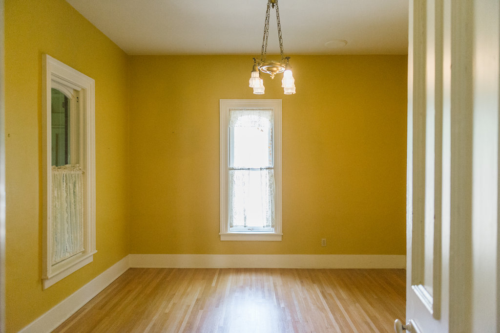
We’re turning this dining room into a kitchen! 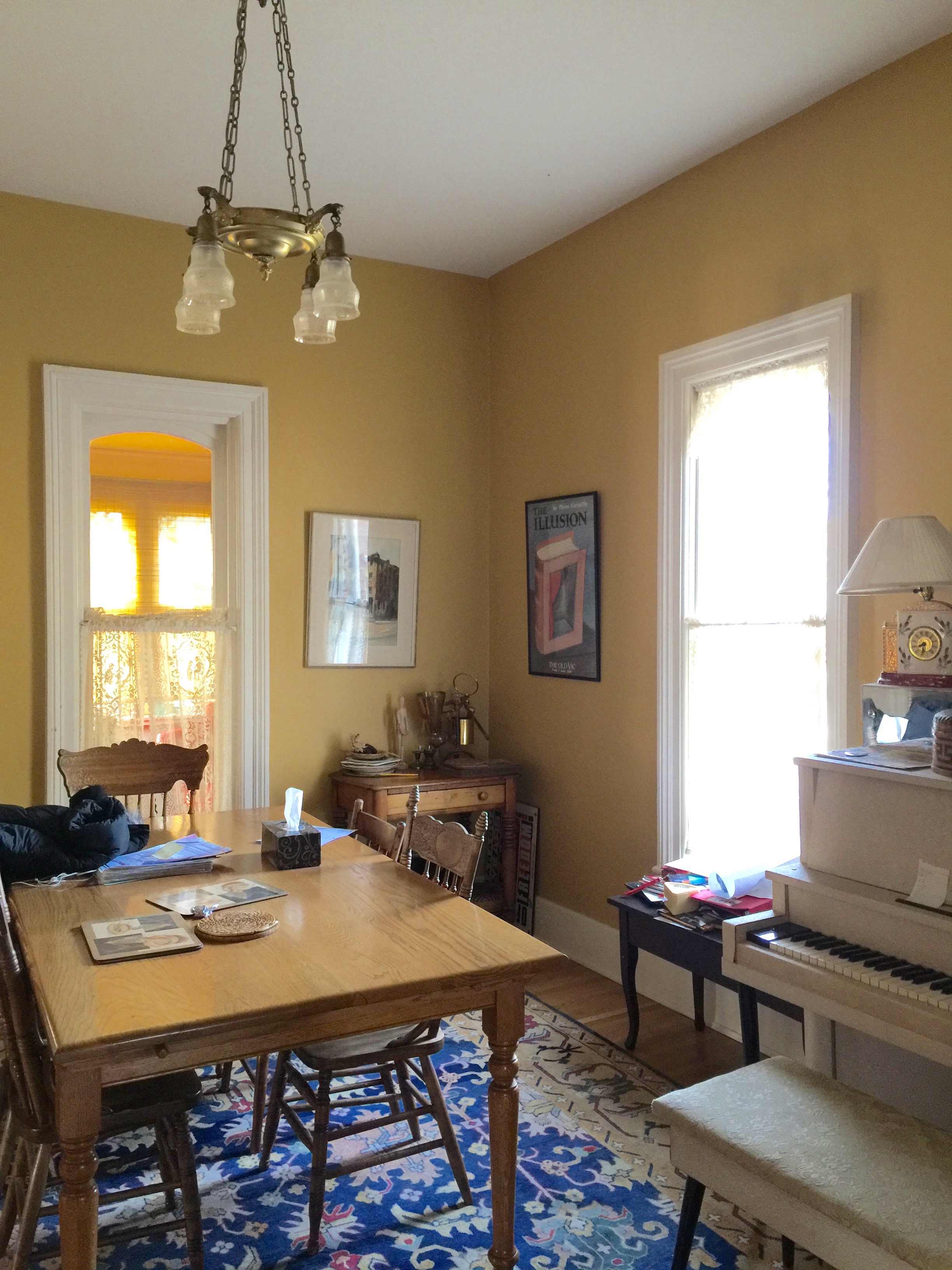
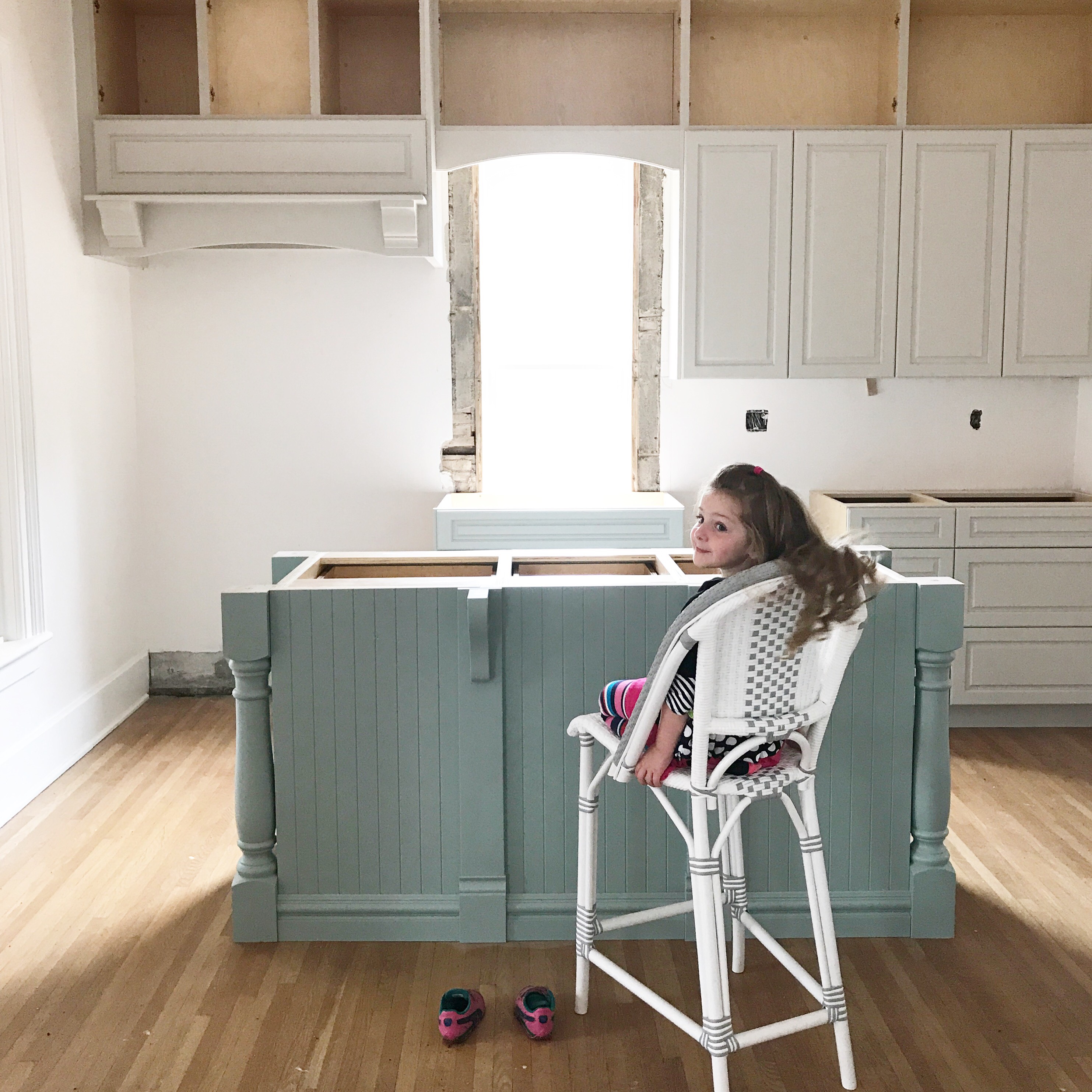
Ok, so back to the backsplash!!
In the past, I have chosen a full quartz slab backsplash and a white ceramic bevelled subway tile backsplash. (check out both kitchen backsplashes by clicking the links in the previous sentence ;)) This time, I knew that I wanted handmade clay tiles as a backsplash, like I showed in my initial inspiration image for the space. 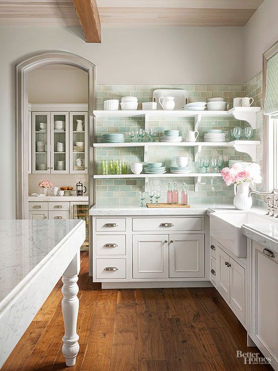
My favourite thing about the tiles in this image was the mint colour and the high variation of colour. I searched high and low to find out how to source a similar tile. It was actually one of my followers who led me to the company of my dreams, when I posted the above image on my feed asking for help! (Thank you so much @fouahamz !)
Mercury Mosaics
I am so smitten with this company I cannot even tell you. I searched through their Instagram account and website and found a photo that I loved! Look in the comments on the right…that’s me! hahah! 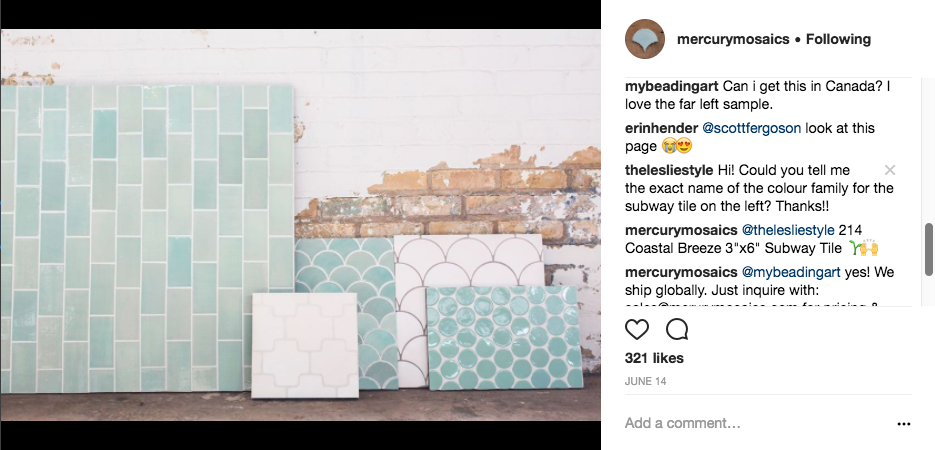
Once I fell in love with this image, I researched the company online and then fell head over heels for them!
Watch This OMG
Wanna fall in love too?? Watch this video! Warning…you will immediately want to join their gorgeous tile movement and have their artwork in your home!
Next, I emailed the company and met the most incredible person– the owner and CEO of the company Mercedes Austin (who is in the beginning and end of the video). She is incredible and has single handedly helped me choose, layout, calculate, and render the tile of my dreams.
Normally, I kind of guess that what I’m thinking will work out and hope that the scale of my pattern translates once it’s installed. Ummmm that sometimes works well, sometimes works ok, and sometimes doesn’t work at all, and sometimes I wish I could have made changes! Not with Mercury Mosaics…unh unh. No wondering if your pattern and choices will work out.
Backsplash Tile Calculator
First Mercury Mosaics helps you calculate your tile with their ridiculously helpful blog post “How to Measure a Kitchen Backsplash” and their downloadable tile calculator that looks like this!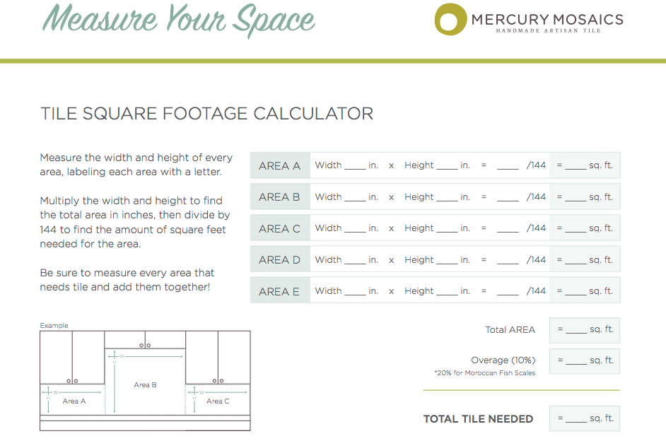 Yup, and if that’s not enough once you’ve measured, you send them a photo of your space and they double check all of your measurements. Next comes the part that will BLOW YOUR MIND!
They create a rendering of your space to scale with your chosen tile and pattern. I’m not kidding!
Wait, I Changed My Mind!
Before I show you my final choice and rendering, I have to tell you that I changed my mind from the photo above. It wouldn’t be me if I didn’t have an existential crisis during the renovation. I know right?! WTF. K, when I got the sample in my kitchen, it felt too green/mint for the paint colour that I chose for my island which was Wythe Blue from Benjamin Moore. If you know this colour, then you know that it is a little chameleon. It morphs from green to blue right before your very eyes, like 50 times a day. You just can’t pinpoint if it’s more blue or more green, so I needed a little tile chameleon to go with it.
I felt like giving up…how do you pick a tile for a colour-change island! It’s like a Vuarnet Surf Style jacket from the 80’s, remember those?! In case you don’t (how could you not?!), allow this image to jog your memory! I wonder where my Vuarnet jacket is…would totally like to wear it for the reveal!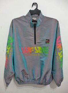
So, at this point I did something I never do. I asked for help. I’m a control freak and I usually force myself to panic endlessly on my own, but I truly trusted someone. I asked Mercedes the tile Maven/Siren/Savant, what she thought about my dilemma, and you know what? She answered in the kindest way ever.
She told me that I wasn’t annoying and wasn’t bothering her, since I had maybe sent 3 emails in one day saying “I’m so sorry for bothering you and being so annoying”, and she took her time and suggested 22E Blue Opal.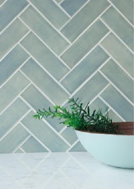
This drop dead gorgeous tile doesn’t exactly know if it’s blue or green and ummm that’s exactly how my island feels, you know?! (and myself for that matter!! lol!)
So I pulled the trigger, wanna see my rendering? It’s so damn cool! If I had any doubts whether I had made the right decision, they disappeared after I got this! What do you think of my choice, btw?!?!
Backsplash Tile Rendering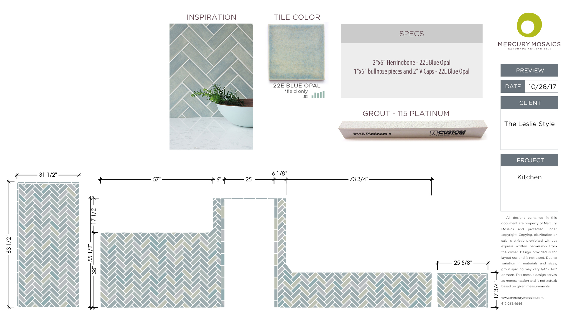
Shape, Size, Pattern
How freaking cool is that???? I decided on a herringbone pattern because it felt like the pattern went with the character of my 1886 home. A herringbone pattern also adds detail to the large area over the range. We couldn’t get a pot filler in this kitchen because the range is on an exterior wall that isn’t insulated to today’s standards, so the plumber was worried that the line would freeze.
So, my hope is that with the high variation in colour and detailed pattern, you won’t even notice…I probably shouldn’t have told you! lol! Oh and I went with a 2×6 tile. I find that a 3×6 is too wide to get the right herringbone proportions. It’s pretty amazing how many tile shapes and sizes you can choose from at Mercury Mosaics!
I’m going to leave you with some super cool inspiration images from Mercury Mosaics. So crazy– they have done the mosaics in all 131 Lululemon stores! Wow just Wow! Make sure you check out their Instagram account if you’re in the mood for a kick-ass backsplash!
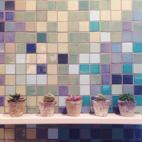
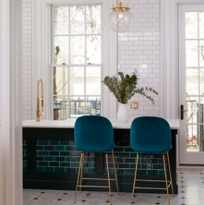
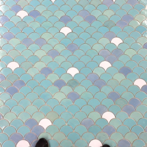
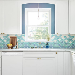
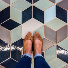
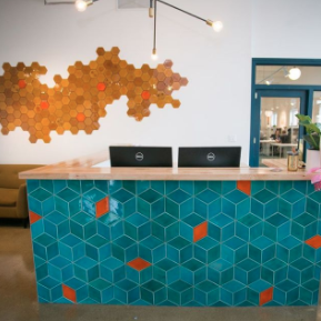
Next week, I will get to the countertop choice, our faucet, and some of the Colourful Kitchen Renovation styling…then the following week the whole SHEBANG! Woo hoo…the kitchen will be done! From now till then, I’ll be sourcing things like the cafe curtain for over the kitchen window, some small appliances for the counter top, and planning the reveal! Oh and having the backsplash installed of course! Can’t forget that!
See you next week!
Don’t forget to have a look at the rest of the One Room Challenge projects and all of their progress! 

oh love the herringbone and YES what a fabulous backsplash it will be in 2 weeks! can’t wait to see it all done!
Thanks Tim!! Yes I can’t wait for it to feel polished and finished and start sharing it! thanks for the encouragement!!
I can’t wait to see it, Leslie! I can’t believe how far this space has come already!
Oh thank you…I can’t wait to show you!!
Sooo love you and all of the work you and Matt have done so far, it’s been so inspirational for us and perfectly inline with all of the style and selection we have picked for our old home Reno/revamp….and truthfully as I’m reading this post and see you’re first pick my initial thought was, gorgeous but for the first time (while following you as we both work on these homes) this was not really the style I am drawn to for our kitchen backsplash….the tile style reminded me a little of my Arielle style bedroom growing up but still loved the color haha as I continue to read and reach your final pick i just couldn’t help but laugh…I also just picked the Long herringbone style as our backsplash and one of you Insp (emerald green tile)photos was also one of mine. I think you made the perfect Parisian pick! Dying now to see your faucet….I have been having the worst time trying to select just the right shade of brass for our kitchen!!
Thank you again for letting us follow on your journey! It has been my favorite
Hi Ashley,
oh I’m so glad you like it in the end! It’s been such a tough decision…yes I know what you mean about the first tile…it felt too candy shop for the kitchen in a way. Can’t wait to see it installed! Congrats on your renovation! I’d love to see pics! Oh yes the faucet was a tough choice! I can let you in on a secret though, I didn’t get brass this time…I’ll show you it next week and hopefully you like it! Thanks so much for following along and for the encouragment!
Loved the first option you were going with, but I think this second option actually goes better with this homes vibe. Excited to see it all come together friend!!!
Hey Tana, ok awesome so glad you think so…I have decision fatigue!! ahaha!! thanks for the comment girl!