I’m so excited to share our Lake House Kitchen Renovation Reveal with you because the layout is beyond unconventional and like no other I have ever seen! If you look closely, there are no blank walls to put it on! lol! I started taking down walls and I couldn’t stop! The whole back of the house is on the water and maximizing the views was priority #1. Can you believe it, this home started off with a galley kitchen and since 1922 no one could cook and look out at the water at the same time! I was dying to open it up and give the kitchen the dreamy view of Lake Erie that it deserved! I went back to the basics to create this classic coastal white kitchen with a mix of timeless white, brass, grey, and light wood tones. Ok let’s do this, come see the Lake House Kitchen Reveal!
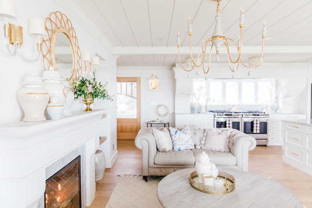
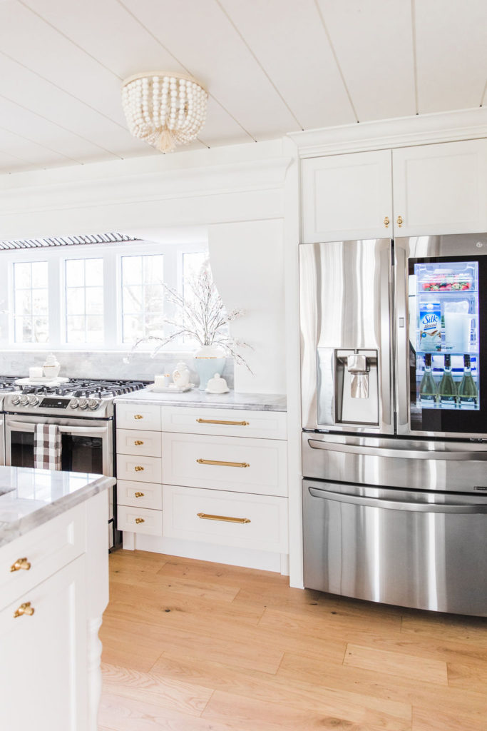
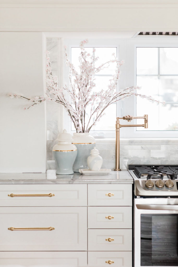
In order to accommodate a living room and kitchen in the space, I really needed to think outside the box. That’s where the idea to put the ranges on the front wall of the house came from. The ranges are now exactly where the original kitchen sink window was.
I designed the huge corbels beside the ranges and had them made. That was such a scary decision to design an element but it’s one of my favourite things in kitchen for sure! You can read more about that decision, here.
By putting the ranges in front of the existing window, the front exterior of our home has been undisturbed and there is the same matching window opening in the family room. The exterior is a very symmetrical and Historic 1922 Cape Cod, so changing a window opening was not an option. This is our second heritage home that we’ve renovated!
The family room with the matching set of windows is on the other side of the living room fireplace. I’m going to be revealing that space in the next couple months.
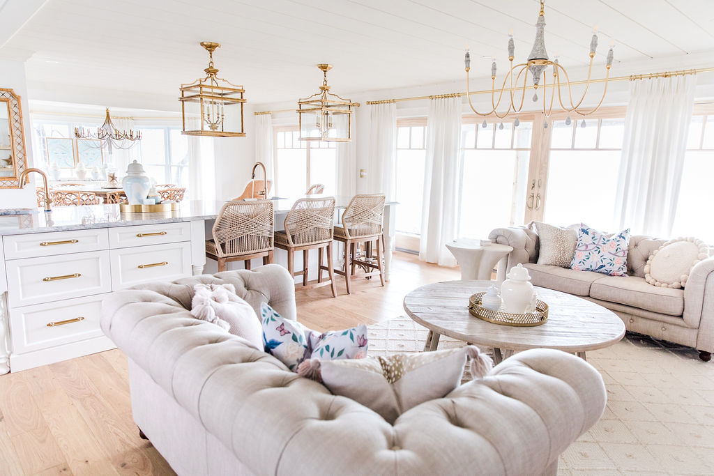
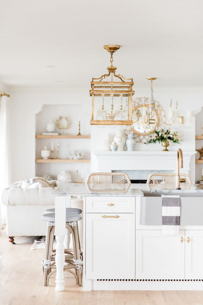
I really wanted a living room open to the kitchen because it’s where we spend 99% of our time, so I turned the island the opposite way to where it would normally be parallel to the ranges in most new kitchens. This decision was also a must because I did not want our back to the lake. The entire back of the house all the way across is patio doors with Lakeviews. I can’t wait to show you those views soon!
You can see our Lake House Reno Living Room reveal here, if you haven’t yet.
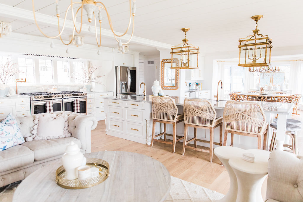
The ceiling beam (disguised as crown moulding) running parallel with the front wall the ranges is on, used to be a wall and there was a doorway right where our coffee bar is, so basically a door right after the rattan mirror hanging on the wall.
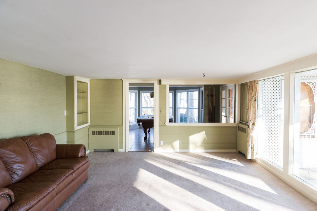
Before and After
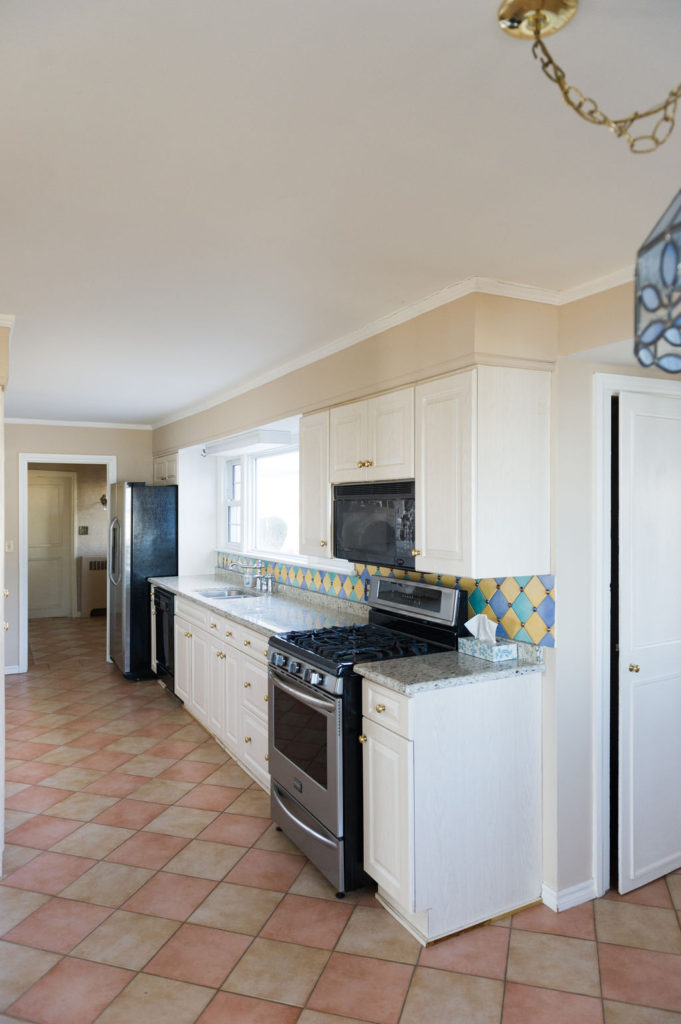
You kind of wouldn’t even believe it’s the same house because it began with a Galley Kitchen.
The window opening above is the exact same size in both photos just with a new configuration. Different from the before pic, our kitchen sink is now located in our island.
We were able to take down the wall on the left that separated the galley kitchen from the living room, and the choppy walls that separated our now dining room from the new kitchen island. The entire space is open from the dining room to the living room.
If you’d like a closer look at the dining room, you can see the dining room reveal, here.
It was a lot of sleepless nights trying to figure out the layout, but in the end we LOVE it! Having the rest of the house totally open with windows overlooking the lake uninterrupted across the entire back of the house was definitely the right choice for us! I can’t wait to get pictures that really show the water views!
Appliances
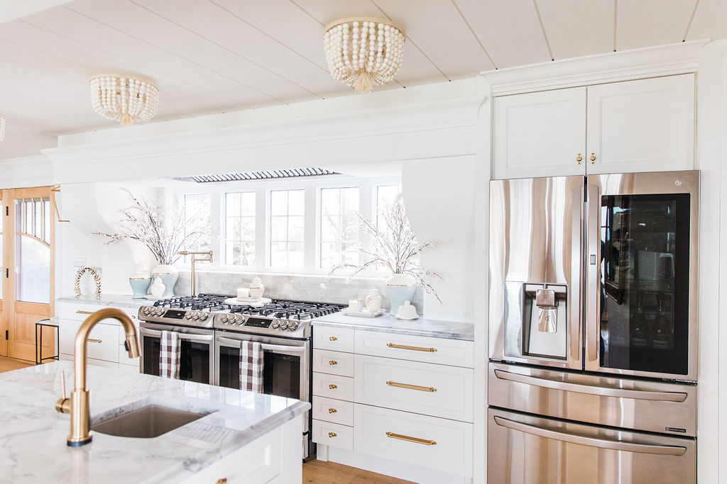
All of the appliances in our kitchen are from The Brick and they always seem to be what people love and comment on when they come into our home!
If you’re interested in finding out more about why I chose to go with 2 gas ranges and seeing more photos of our new kitchen, check out my recent post, Two Gas Ranges Side by Side in the New Lake House Kitchen
I’ll also be sharing all of the details of our LG appliances in an upcoming post. I can’t wait to show you all the bells and whistles the refrigerator has!!
Sinks and Faucets
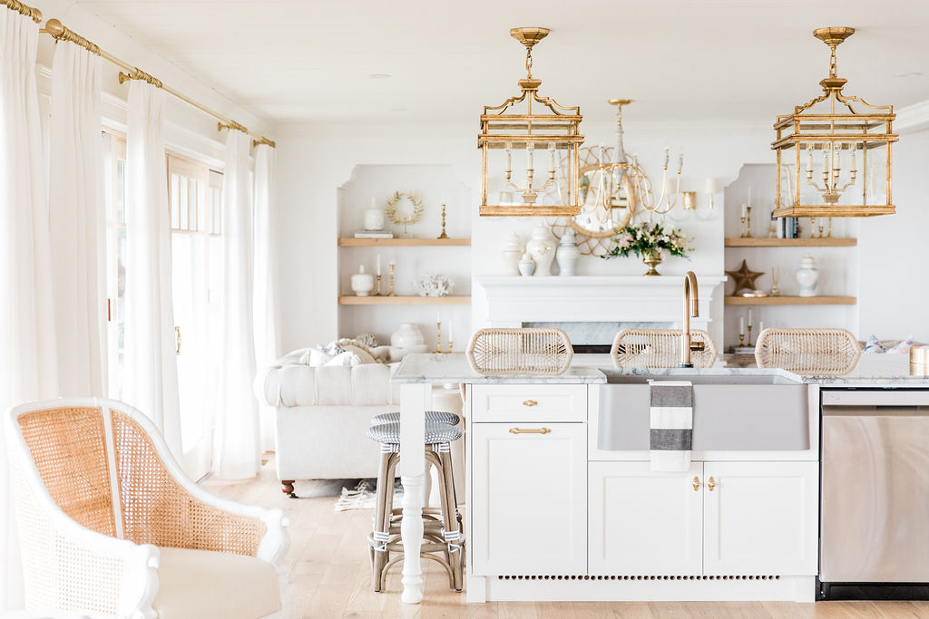
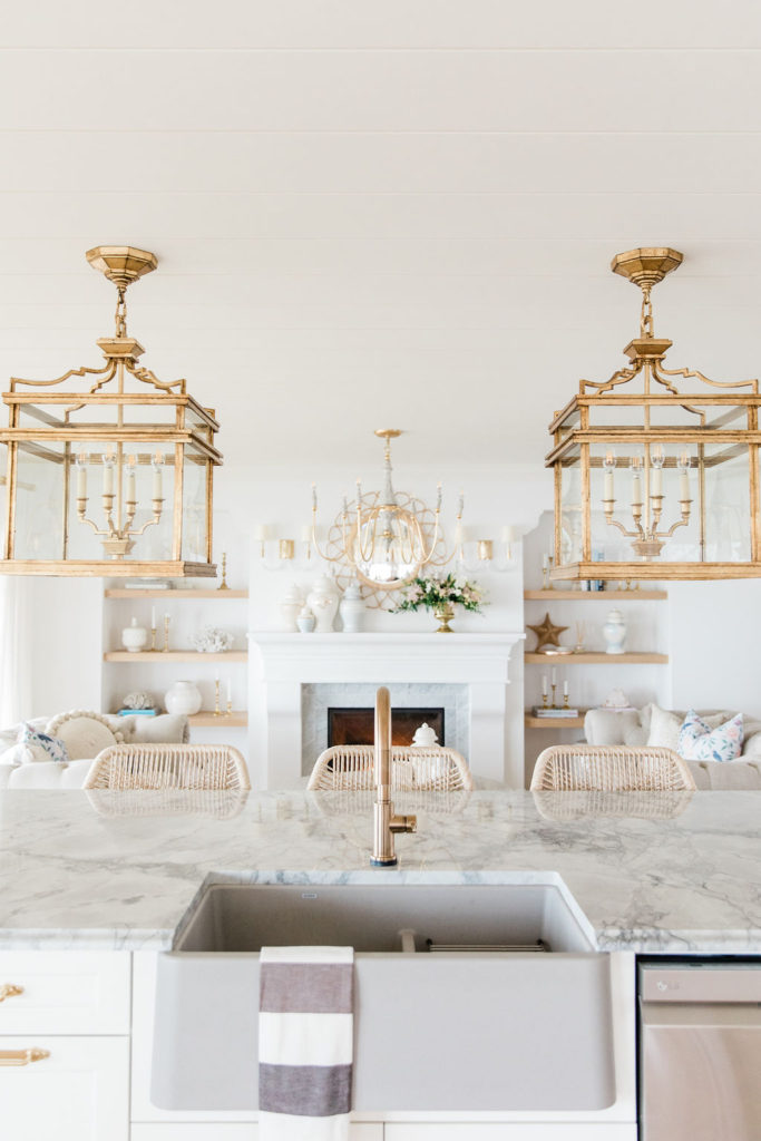
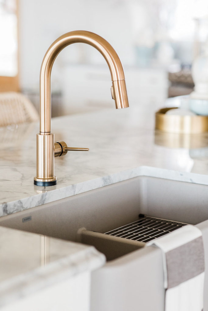
All of our sinks are from Blanco. Our island sink is the IKON 33 1 3/4 Low Divide and the SILGRANIT material and concrete grey colour makes them bullet proof! They just came out with this colour and I love it! I have never had a sink that wasn’t a ton of work to keep clean and these are amazing…zero maintenance and I love the cool grey against the warm brass of the champagne bronze Delta Trinsic faucets.
We had these exact Trinsic Single Handle Pull-Down Kitchen Faucets with Touch2O Technology in our Midcentury to Modern French Country Kitchen and we missed them so much! Honestly, once you have a touch faucet it is so addicting. It totally takes a week or so to get used to it, but then it’s all over…you officially can’t live without them after that.
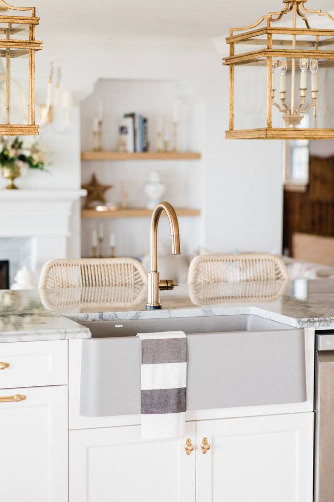
I’m over the moon happy that this farmhouse sink has a second bowl which I use to dry all my dishes. I couldn’t live without it because I never have a dish drying rack on the counter- I always buy the smallest dish rack and sit it down on the right side in my sink so it’s hidden from sight. I have never seen a farmhouse sink with this bowl type that is totally hidden from sight from the front -so genius!
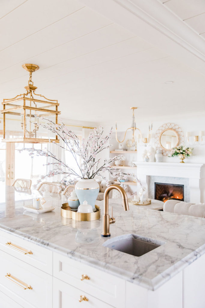
Matt is a super chef and really wanted his own area to work from at the island, totally uninterrupted by stools and his own prep sink. I love the shape of the Blanco Diamond Mini prep sink I chose. We actually turned the sink the opposite way in the cabinet, so that the front of the island looks like it’s covered in cabinetry and he can work on the end -opposite the range. He loves it! We paired the prep sink with the matching Delta Single Handle Pull-Down Bar / Prep Faucet with Touch2O Technology which is so perfect for messy hands to be able to touch it with your forearm to turn on and off.
Countertops
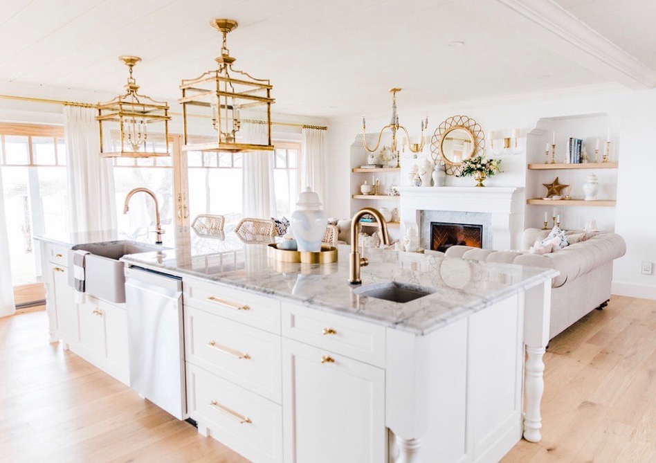
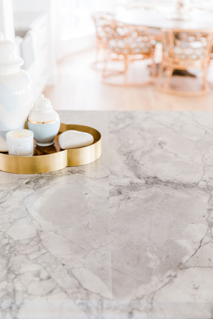
I went with Superwhite Extra Quartzite for our countertops and I’m so in love! Quartzite is not quartz and it’s not man made. Quartzite is similar to marble or granite in that it is a natural stone slab and each slab is totally unique! It’s not at all stainable like marble but has all the beautiful veining marble does (unlike granite which I’m not a fan of the pattern). So it’s just like a win/win/win in my books and it’s one of my favourite choices- I love the natural beauty of the stone.
One of the biggest surprises was that where I chose to have the seam in the island ended up making a heart. I was so freaking happy I can’t even tell you because it was a super stressful decision when you’re picking a place for a seam. It felt like the universe was winking at me or giving us a big hug- saying this home was going to be the right fit for us and that we were doing the right thing…it’s hard to explain but the heart means so much every time I see it! Our fabricator was excellent and linked below in the sources.
Ceiling
We achieved the look of our ceiling with Metrie Option M Shiplap linked here. We used 16′ legnths, so we have no seams! The ceiling looks amazing and feels so coastal. With 8′ ceilings the shiplap really adds much needed character and they are just stunning in person. The crown moulding that I used is this one linked here. I used this Metrie crown as the crown in my kitchen as well, so that everything flowed seamlessly.
Drapery
Our drapery is from Q Design (They do all the most amazing designer homes like Jillian Harris…now I know why!) Q Design drapes are insanely gorgeous and make your home feel so designer and by desiginer I mean polished, warm, and finished! Our drapes are the cozy linen in Polar with 6″ 2 fold pinch pleats with cotton lining, length: kissing the floor. The hardware is the satin brass linked here, and I chose the knob finial. You can see the install of this drapery on my Instagram story here. I am so happy with them!
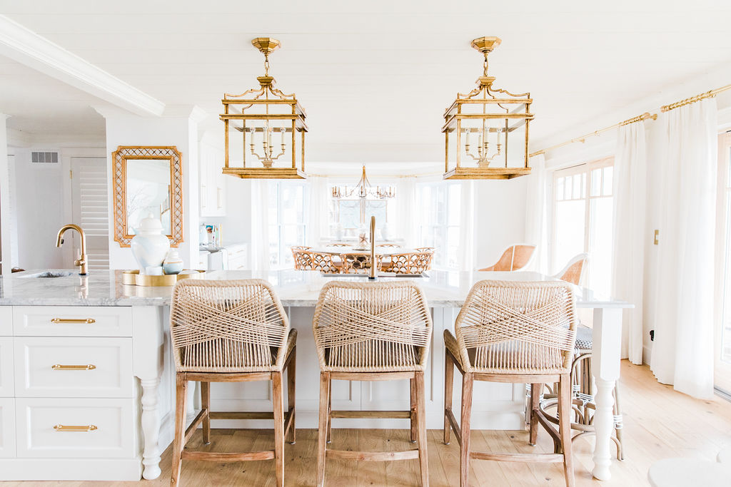
Curious about what’s between the island and the dining room, on the left? I added a coffee and wine bar. In case you haven’t seen that space, check out the coffee and wine bar reveal, here.
Life Hack
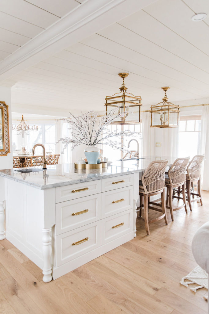
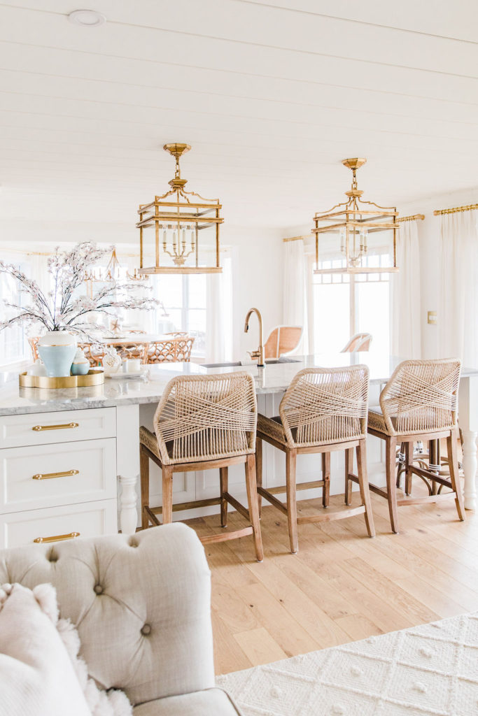
These extra two stools are the biggest life hack ever! I really wanted upholstered stools because I love the look so much, but I needed two stools that could be cleaned easily for our two daughters, so mixing and matching the stools has been the perfect solution for us! They also love having their own dedicated area at the end of the island to sit next to each other and work on their art.
I would love to hear what you think of the new kitchen, and if you have any questions, please share them in the comments below!
In case you missed our other Lake House Renovation reveals, get caught up below 😉
Lake House Coffee and Wine Bar Reveal
Two LG 30″ Gas Ranges Side by Side at the Lake House
Sources
Appliances – The Brick : Gas Ranges, Refrigerator, Dishwasher
Cabinetry – Kitchen Korner
Countertops – Designer Countertops Leamington
Sinks – Blanco – Island Farmhouse Sink, Prep Sink
Faucets – Delta Faucet Canada – Kitchen Faucet, Prep Faucet
Pot Filler – Brizo
Counter Stools – Rope Stools, Cafe Stools
Cabinet Hardware – Rejuvenation
Drapery – Q Design
Ginger Jars – Lauren Haskel Designs
Accent Trays on Island – Brass Tray, Ceramic Tray
Shiplap Ceiling and Crown Moulding – Metrie
Beaded Flushmounts – Pottery Barn Kids
Island Lights – Visual Comfort
Hardwood Floors – A & A Flooring
Patio Doors – Anderson



I love how you’ve made the kitchen the heart of the home! So many people underestimate the amount of time spent in the kitchen and the opportunity for it to be the hub! This is beautiful, but most of all, I just really love how central it is to the other spaces. Very good design move!
Thank you so much!! I’m so happy you like the layout! It was so different so I appreciate the feedback so much!!
Wow what an incredible redesign of space and functionality paired with coastal style…relaxed yet sophisticated. Couple of questions:
You mentioned in previous posts two things would be shown in the kitchen reveal…
1. The matching drain? Was this the drain board you discussed or the actual drain ring that matches the faucet?
2. How the front door area opened up at the end of the stove window wall…there were a couple of offset images, will you be sharing more of this area and how it connects in a different post?
Hi Kelly,
those are great questions! I can show the drain on my Instagram stories and get a pic to update the post in the future. It’s the actual drains in the sink and they look really good with the concrete grey sinks. I’m super happy we did that. Here is a link to the exact drains
https://www.deltafaucet.ca/kitchen/details/9159-cz-dst.html?accessory=72010
to answer your second question, Yes I’ll be sharing more for sure. The other half of the house, so if you went the opposite direction of the front doors is a family room, a main floor master, the bathroom, and a staircase. You would see the staircase if I shot straight down the range hall looking that way and into the family room. Those spaces are on the way for sure…we’re at the paint phase- still needs to be painted after the work we’ve done. then need to add the furnishings. I’m not sure on the timeline there yet. I will keep you posted!
thanks so much for you comments and for following the project! I really appreciate it!
Hi! I am looking for a chesterfield sofa/loveseat, just like those shown in your living room. Can you share your source?
BTW, everything is absolutely beautiful!
Thanks so much!
Terri
Thanks so much!!
Hi those are from RH…we actually got them on craigslist and they have been at 3 hours with us-they have been amazing quality and such a good find! Definitely highly recommend them!
Oh my gosh thank you so much! Thank is just the kindest thing and is making my Saturday over here! Thank you again!